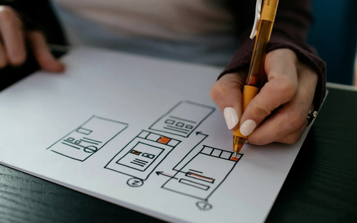



A beautiful website can still be difficult to use. Behind polished interfaces, impressive animations and carefully chosen typography, there can be UX problems that quietly frustrate users, reduce conversions and undermine trust. Good visual design gets attention, but good UX determines what happens afterwards. This article explores the hidden experience problems that can make an attractive website ineffective, and why designing for users requires much more than making a digital product look good.
A beautiful website can still be difficult to use. Behind polished interfaces, impressive animations and carefully chosen typography, there can be UX problems that quietly frustrate users, reduce conversions and undermine trust. Good visual design gets attention, but good UX determines what happens afterwards. This article explores the hidden experience problems that can make an attractive website ineffective, and why designing for users requires much more than making a digital product look good.
A website can look absolutely brilliant and still fail at the one thing it was supposed to do. It can have beautiful typography, carefully selected imagery, sophisticated animations, impressive transitions and a visual identity that feels unmistakably premium, yet leave users wondering where they are supposed to click, what they are supposed to do next or whether they can actually trust the organisation behind it. This is one of the more uncomfortable truths about digital design because visual quality is easy to see, while good user experience often reveals itself through things that users barely notice.
That is not a criticism of visual design. Far from it. A strong visual language can establish credibility, communicate personality and make a product memorable. The problem starts when aesthetics become the definition of "good design". A website is not successful because someone says, "That looks amazing." It is successful when the right people can understand it, navigate it, use it and complete what they came to do without unnecessary friction. Sometimes the best UX work is almost invisible because, when it is done properly, the experience simply feels obvious.
At CreativeIyke, this distinction sits at the centre of how we approach UX/UI design. We believe the interface is only one part of the experience, and that the quality of a digital product should ultimately be judged by how well it helps people accomplish something meaningful. Our Solution First approach therefore starts with the problem, the users and the wider context before moving into visual execution. The objective isn't to make something beautiful and hope people figure it out. It is to create an experience where the visual design and the underlying usability reinforce each other.
Beautiful Is Not the Same as Usable
The confusion between UI and UX is partly responsible for this problem. User interface design concerns the visual and interactive layer of a product, including typography, colour, spacing, components, imagery, buttons, forms, navigation and visual hierarchy. User experience design considers the broader relationship a person has with the product, including what they need to accomplish, how they move through the experience, what information they require, what happens when something goes wrong and whether the overall journey makes sense.
The two disciplines are deeply connected, but they are not interchangeable. A beautifully designed button that users cannot find is still a problem. A sophisticated navigation system that looks elegant but forces users through six unnecessary steps is still a problem. A visually impressive form that asks people for information they don't understand is still a problem. And a beautifully branded website that takes too long to load can lose people before they have even experienced the design.
This is why good UX cannot simply be layered on top of visual design at the end of a project. The experience needs to influence the structure from the beginning. When UX and visual design work together, aesthetics become part of the communication system rather than decoration sitting on top of the product.
BEAUTIFUL UI VS EFFECTIVE UX
[ VISUAL LAYER ]BEAUTIFUL UI
- ▹ Typography
- ▹ Colour
- ▹ Imagery
- ▹ Animation
- ▹ Visual hierarchy
- ▹ Brand expression
EFFECTIVE UX
- ▹ Clear goals
- ▹ Logical journeys
- ▹ Useful content
- ▹ Accessible interactions
- ▹ Feedback & error recovery
- ▹ Successful task completion
Caption: Visual quality attracts attention. User experience determines whether people can successfully use what they've found.
The First Hidden Problem: Nobody Knows What to Do Next
One of the most common UX problems hiding behind beautiful websites is surprisingly basic: the interface does not give users a clear next step. The design may have a striking hero section, beautifully composed imagery and a collection of carefully styled cards, but the user's actual journey has not been considered with the same level of care. The page communicates that the organisation is sophisticated, but it doesn't necessarily communicate what the visitor should do.
This often happens when businesses try to make their website say everything at once. Multiple services compete for attention, several calls to action appear at the same time and important information is buried beneath marketing language. The designer may have created a visually balanced composition, but the user is left to work out which option matters to them. Visual hierarchy without behavioural hierarchy can become a beautifully arranged form of confusion.
A strong UX approach asks what the user is likely to be thinking at each stage. Someone arriving at a website may be asking, "Am I in the right place?", followed by "Can you solve my problem?", then "How does this work?", "Can I trust you?", and finally "What do I need to do?" The interface should help answer those questions in an appropriate order rather than forcing the user to reconstruct the organisation's proposition themselves.
The Second Problem: The Website Was Designed Around the Business Instead of the User
Businesses naturally organise information according to how their organisation is structured. They may have departments, service categories, internal terminology and organisational priorities that make perfect sense to the people who work there. Unfortunately, customers don't necessarily think in the same way. A visitor is usually not interested in navigating your internal organisational chart. They are trying to solve a problem.
Imagine a professional services company with separate departments for consulting, technology, implementation and support. Internally, those categories may be perfectly logical. A potential client, however, may simply be looking for help launching a digital product. If they are forced to understand the company's internal service structure before they can work out which service applies to them, the information architecture is creating unnecessary cognitive effort.
This is where user research and information architecture become valuable. Instead of asking only how the organisation wants its services presented, the design process should explore how customers describe their problems, what they search for, which questions they ask and what information helps them make decisions. The difference can be subtle, but it can completely change the structure of a website.
The Third Problem: Too Much Choice Creates Friction
More options can feel like a better experience from the business's perspective. More services, more products, more navigation links and more calls to action appear to give users freedom. In reality, an abundance of choices can make decision-making harder, particularly when the differences between options aren't immediately obvious.
This doesn't mean websites should be artificially simplistic. Complex organisations often need to communicate complex information. The challenge is to organise that complexity in a way that matches the user's needs. Progressive disclosure, sensible categorisation, filtering, search, clear labelling and contextual guidance can allow sophisticated products to remain understandable without hiding important functionality.
A good designer isn't necessarily trying to remove complexity. They are trying to manage where the complexity appears. The underlying system might be extremely sophisticated, but the user should only have to deal with the complexity that is relevant to the task in front of them.
COMPLEXITY MANAGEMENT
Caption: Good UX doesn't eliminate complexity from a product. It prevents unnecessary complexity from being pushed onto the user.
The Fourth Problem: Beautiful Animations Are Slowing Everything Down
Animation can be wonderful when it communicates relationships, provides feedback or gives an interface a sense of continuity. It can also become a performance problem when every element needs to move, fade, slide or transform before the user can interact with it. A website can look incredibly polished in a design presentation and feel painfully slow on an actual mobile connection.
This is an important reminder that UX exists beyond the design file. A designer may be working with a fast development environment and a powerful computer, while users could be accessing the final product from an older smartphone over an unreliable connection. If the experience has been optimised for the designer's environment rather than the user's reality, the finished product can fail despite looking exactly as intended.
Performance is therefore part of UX. Load times, responsive behaviour, image optimisation, code efficiency, perceived performance and interaction responsiveness all influence whether users feel that a product is reliable. A beautiful website that makes people wait is still creating friction, and users don't particularly care how sophisticated the animation was when they designed it.
The Fifth Problem: Mobile Was Treated as a Smaller Desktop
Responsive design is now standard practice, but simply making a desktop interface fit onto a smaller screen does not necessarily create a good mobile experience. Mobile users have different constraints, different interaction patterns and often different contexts. They may be using one hand, moving between locations, dealing with distractions or trying to complete a task quickly.
A desktop navigation structure that becomes a cramped mobile menu is not necessarily responsive UX. A large table that becomes almost impossible to read on a phone is not necessarily responsive UX. A form designed for a keyboard and mouse can become frustrating when every field requires tapping and typing on a touchscreen. The screen size changed, but the experience didn't really adapt.
Good responsive design considers what the user is trying to accomplish and how that task should behave at different breakpoints. Sometimes that means rearranging content. Sometimes it means changing interaction patterns entirely. The objective is not simply to make everything fit. It is to make the experience work.
The Sixth Problem: Forms Are Designed for the Organisation, Not the Person Filling Them In
Forms are where beautiful interfaces often meet the reality of user behaviour. A form can have elegant fields, perfect spacing and a sophisticated component system while still being unnecessarily difficult to complete. Users may not understand why information is being requested, which format is expected or what will happen after submission.
Long forms are particularly revealing because every unnecessary question increases friction. Asking someone for information you don't genuinely need creates cognitive and practical costs. Poor error messages create another problem by telling people that something is wrong without explaining how to fix it. If a user enters a date in the wrong format and receives "Invalid input", the system has identified the problem but hasn't actually helped the person resolve it.
Better form design considers the entire interaction, including labels, instructions, defaults, validation, error recovery, accessibility, field order and confirmation. Sometimes the best improvement is not a prettier form at all. It is removing three fields, changing the wording of two questions and explaining why one piece of information is required.
The Seventh Problem: Accessibility Was Added at the End
Accessibility is sometimes treated as a compliance exercise that happens after the design has already been completed. A contrast checker is run, some accessibility issues are fixed and the team moves towards launch. That approach misses a much bigger opportunity because accessibility can influence the fundamental design of the experience.
People interact with websites in different ways. Some use keyboards rather than a mouse, some rely on screen readers, some have visual or hearing impairments, some experience cognitive or learning differences, and many people simply encounter temporary circumstances that affect how they interact with technology. A cracked phone screen, poor lighting, noisy surroundings or an injured hand can change the way somebody uses a digital service.
Designing with accessibility from the beginning usually creates better products for everyone. Clear hierarchy, understandable language, strong focus states, sensible interaction patterns, appropriate contrast and predictable navigation don't only benefit people with permanent disabilities. They reduce friction across the entire user population.
DESIGN QUALITY CHECK
| Design Question | Weak Approach | Strong Approach |
|---|---|---|
| Navigation | Does it look clean? | Can users predict where it leads? |
| CTA | Is it visually prominent? | Is the action clear and relevant? |
| Forms | Do the fields look polished? | Can users complete them without confusion? |
| Accessibility | Does it pass a final check? | Was it considered throughout design? |
| Mobile | Does it fit the screen? | Does the task remain easy to complete? |
| Performance | Does it look impressive? | Does it respond quickly in real conditions? |
| Content | Does it sound professional? | Does it answer the user's actual question? |
| Errors | Does the interface show an error? | Does it help the user recover? |
Caption: Good UX asks behavioural questions, not just visual ones.
The Eighth Problem: The Content Looks Good but Says Very Little
Copy is often treated as something that arrives after the design. The designer creates the structure, placeholder text is inserted and then the final content is added later. That workflow can create a surprisingly large UX problem because content isn't simply decoration. It is part of the interface.
A beautiful page containing vague statements such as "We deliver innovative solutions for the modern world" may sound professional, but it gives the user very little useful information. What solution? For whom? What problem does it solve? What makes the organisation different? What happens next? Users shouldn't have to decode marketing language to understand a service.
Content design and UX therefore need to work together. Headings should help people scan, labels should reduce ambiguity, instructions should support tasks and calls to action should communicate what happens when someone clicks them. Strong visual design can draw attention to the right content, but it cannot compensate for content that doesn't answer the user's questions.
The Ninth Problem: The Website Assumes Users Will Behave Perfectly
Real users make mistakes. They enter incorrect information, click the wrong thing, abandon tasks, return later, lose connectivity, forget passwords and sometimes misunderstand instructions. A product designed around the assumption that everyone will behave exactly as expected is likely to create frustration when reality inevitably intervenes.
Error states are therefore part of the experience, not exceptions to it. Good UX considers what happens when something goes wrong and gives users a clear route forward. A payment fails. A document won't upload. A session expires. A search returns nothing. An account cannot be verified. These moments can determine how trustworthy the entire product feels.
This is particularly important for financial, healthcare, government and other services where users may already be anxious or dealing with high-stakes situations. A vague error message can turn a small technical issue into a significant experience problem. Good error handling acknowledges what happened, explains what the user can do and, where possible, prevents the problem from occurring in the first place.
The Tenth Problem: Nobody Tested the Design With Real People
One of the most dangerous assumptions in digital design is that if the internal team understands the interface, users will understand it too. The team has spent weeks or months immersed in the product. They know the terminology, understand the business logic and have seen every version of the journey. Users haven't.
Usability testing can expose problems that are almost impossible to identify through internal discussion alone. Give someone a realistic task and watch what happens. Where do they hesitate? What do they click first? What do they misunderstand? What do they expect to happen? Where do they abandon the journey? The answers can be surprisingly different from what the team expected.
Testing doesn't have to mean assembling a huge research programme before every design decision. Even focused testing with representative users can reveal valuable issues. Combined with analytics, customer feedback, support enquiries and tools such as session recordings or heatmaps, it can create a much clearer picture of how the experience performs in reality.
The UX Audit: Finding What Beautiful Design Hides
This is where a UX audit can become particularly valuable. Instead of looking at a website purely through the lens of aesthetics, an audit examines the experience systematically. It can consider information architecture, navigation, content, accessibility, responsive behaviour, forms, interaction patterns, conversion journeys, performance and consistency.
The purpose isn't to create a long list of things that a designer personally dislikes. A useful audit should connect observations to user needs and business objectives. If users are abandoning an enquiry journey, for example, the investigation should explore why. If an important service receives very little engagement, the team should investigate whether discoverability, terminology, content or trust is contributing to the problem.
UX AUDIT FRAMEWORK
Intent & Motivation
What are people trying to achieve?
Architecture & Clarity
Can they find and understand what they need?
Flow & Usability
Can they complete tasks easily?
Inclusion & Standards
Can different users access the experience?
Speed & Stability
Does the product respond quickly and reliably?
Conversion & Alignment
Does the experience achieve its intended purpose?
How CreativeIyke Approaches UX Differently
At CreativeIyke, we don't see UX/UI design as a process of making screens look better. Screens are an output of the process, not the starting point. Our approach begins with Discovery & Audit, where we examine the problem, user needs, existing experience and wider technical landscape. This helps us understand the constraints before we start making assumptions about the solution.
We then move into System Architecture & UX, where user journeys, wireframes, information structures, component systems and technical considerations begin to come together. This stage is particularly important for complex digital products because a user interface can only be as effective as the system supporting it. A beautifully designed dashboard cannot compensate for poor data architecture, just as an excellent database cannot compensate for a confusing user journey.
During Full-Stack Development, the design becomes a working product. This is where frontend implementation, backend systems, APIs, integrations, infrastructure and quality assurance need to work together. We believe designers and developers should collaborate rather than operating in separate silos, because some of the most important UX decisions emerge when design meets technical reality.
Finally, Launch & Optimisation allows the experience to be evaluated in the real world. Analytics, performance data, user behaviour and feedback help identify what should be improved. The process therefore doesn't end when the design is approved or the website goes live. A digital product is something that can learn and evolve.
CREATIVEIYKE PROCESS
Audit
Understand users, problems, systems and constraints.
UX
Structure journeys, information, interfaces and technology.
Engineering
Turn the experience into a reliable, production-ready product.
Growth
Measure, test, learn and continuously improve.
Caption: Great UX is not a single design phase. It is a continuous process of understanding, designing, building and learning.
The Difference Between a Website That Looks Good and One That Works
There is nothing wrong with wanting a beautiful website. In fact, businesses should care about how their digital presence looks because visual quality communicates something about the organisation behind it. The mistake is assuming that visual quality is the destination. A website exists within a much larger relationship between a business and its users, and that relationship depends on clarity, trust, accessibility, performance and the ability to complete meaningful tasks.
The strongest digital products make these elements feel connected. The brand creates recognition. The interface creates clarity. The content creates understanding. The interaction design creates confidence. The technology creates reliability. Accessibility makes the experience available to more people. Analytics and research reveal where the experience can improve. None of these elements should have to compete with one another.
This is why good UX can sometimes feel almost boring when you look at it closely. There may be no unnecessary animation demanding your attention, no clever interaction trying to impress you and no complicated navigation system showing off how much the designers know. Instead, you simply arrive, understand where you are, find what you need and complete your task. It feels obvious. That apparent simplicity is often the result of considerable thought.
Design the Experience, Not Just the Interface
A beautiful interface can win attention, but it cannot carry an entire digital product on its own. If the navigation is confusing, the content is unclear, the forms are frustrating, the experience is inaccessible or the underlying technology is slow, users will eventually notice. Sometimes they won't even know exactly why they disliked the experience. They'll simply leave.
The answer isn't to abandon visual design. It is to put visual design in its proper place within a broader product and experience strategy. Start with the problem. Understand the users. Map the journey. Identify friction. Structure the information. Design the interaction. Consider accessibility. Test the experience. Build it properly. Then measure what happens when real people use it.
That is the difference between designing something that looks good and designing something that works well.
At CreativeIyke, our Solution First approach brings UX/UI, service thinking, technology, accessibility and business objectives into the same conversation. Whether you're redesigning an existing website, building a SaaS platform, developing a custom web application or improving a complex public-facing service, the question remains the same: what problem are we actually solving, and how do we know we've solved it?
Because good design should certainly look good.
But it should also work.
Think your website looks good but isn't performing as well as it should?
A UX audit can uncover the friction hiding behind the interface. CreativeIyke can assess your website, user journeys, accessibility, content, performance and conversion experience, then turn the findings into a practical improvement roadmap.
RECOMMENDED READING & CORE CAPABILITIES Human-Centred UX/UI DesignUser research, journey mapping, wireframing, design systems, and accessible interface engineering.
Custom Web & Mobile EngineeringHigh-performance full-stack TypeScript, React, and scalable cloud architectures.
Intelligent AI IntegrationsAutomated workflows, AI assistants, and enterprise API capabilities.
Accessibility Is Not a Compliance Checklist: Why Truly Inclusive Design Is a Strategic AdvantageDiscover why designing for all users from day one improves usability, SEO, and business performance.
Solution First: Why We Start With the Problem, Not the ScreenDiscover why starting with the problem rather than the screen leads to better digital products and UX.
The 3-Second Problem: Why Users Decide Whether to Trust Your Website Almost InstantlyUnderstand the subconscious signals that make users trust or abandon a website.

UX/UI designer and developer in Birmingham, UK. I design and build digital products for SaaS, fintech and public sector teams.