


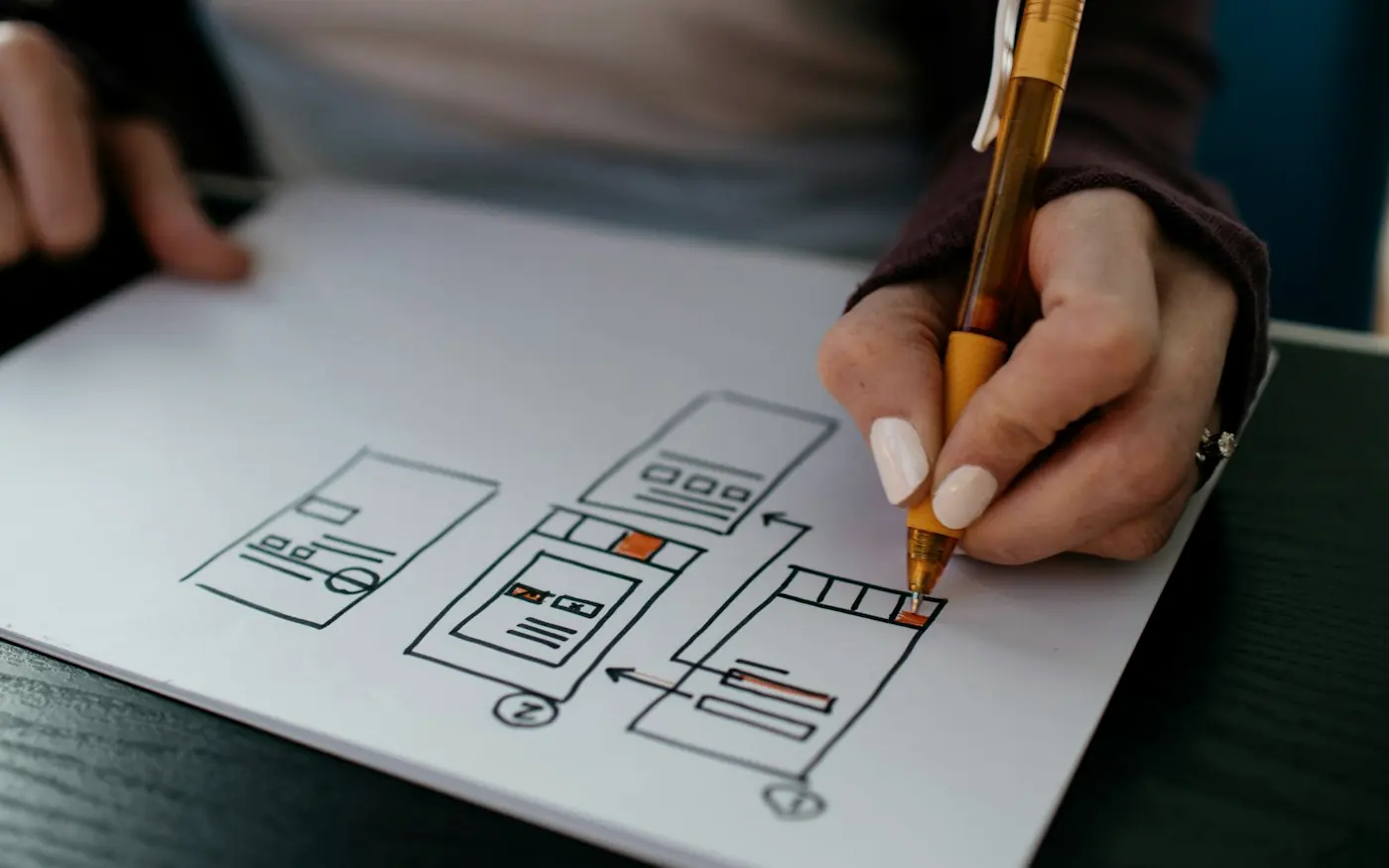
A beautiful interface can win attention, but it cannot carry a digital product on its own. The products people return to are the ones that make sense, respond quickly, remove unnecessary friction and help users accomplish something valuable. At CreativeIyke, we believe good digital product design sits at the intersection of strategy, UX, technology, accessibility and human behaviour. The screen is only the visible part of the experience.
A polished interface can create an immediate impression. The typography feels considered, the spacing is generous, the colours are balanced, the animations are subtle and the whole thing looks as though somebody cared about every pixel. It is the sort of product that makes you want to take a screenshot and send it to somebody. And yet, strangely enough, a beautiful interface can still produce a terrible digital experience. The navigation may be confusing, the workflow unnecessarily long, the application painfully slow, the content difficult to understand or the underlying functionality simply incapable of doing what users actually need.
This is one of the more important distinctions in modern digital product design: looking good and working well are not the same thing. Visual design matters enormously, particularly when a product needs to communicate trust, quality and credibility, but aesthetics are only one layer of a much larger system. A digital product has to help people understand what to do, make decisions, complete tasks, recover from mistakes and achieve an outcome. It also has to work within the realities of technology, business operations, accessibility requirements, security, data and future growth.
At CreativeIyke, this is why we don't approach digital products as collections of screens. We look at the product as a connected experience, where strategy, UX/UI, technology, AI, accessibility and business objectives need to work together. Our Solution First approach begins with the problem rather than the interface, because the most attractive solution is not necessarily the most useful one. Sometimes the right answer is a redesign. Sometimes it is a change to the user journey, a new integration, a custom web application or an entirely different way of delivering the service.
The Interface Is Only the Tip of the Product
When people talk about a digital product, they often describe what they can see. They talk about the dashboard, mobile app, website, navigation, buttons and visual identity. This makes sense because the interface is the part that users physically interact with, but it can also create a misleading picture of what makes the product successful. Behind every useful interface is a collection of decisions about users, information, business rules, technology, data and operational processes.
A banking application, for example, may appear to be a collection of beautifully designed screens for checking balances and moving money. Underneath those screens are authentication systems, payment infrastructure, transaction rules, security controls, APIs, databases, regulatory requirements and fraud prevention mechanisms. If the transfer screen looks exceptional but the transaction takes several minutes to complete or the user cannot understand whether the payment has gone through, the interface has not solved the real problem.
The same principle applies to a SaaS platform, healthcare service, property platform or e-commerce product. The visible interface is connected to a much larger system, and the quality of the experience depends on how well those layers work together. A product can therefore be visually impressive while still being operationally weak. Conversely, a product with relatively restrained visual design can become incredibly valuable because it makes a complicated task feel simple.
THE FIVE INTERCONNECTED PRODUCT LEVELS
Caption: The interface is only one layer of a digital product. The strongest products connect business objectives, user needs, design, engineering and operational systems.
Beautiful Design Still Needs a Job to Do
Good visual design is not decoration. It communicates hierarchy, creates recognition, establishes trust and helps people understand what matters. A well-designed interface can reduce cognitive load, make information easier to scan and guide users towards important actions. The problem arises when visual polish becomes the objective rather than the means to an objective.
A landing page can look spectacular and still fail to generate enquiries. A dashboard can look incredibly sophisticated while making users hunt for the information they need. A mobile application can have beautiful animations while taking too many steps to complete a basic task. In each case, the design may be technically accomplished, but the product is not necessarily doing its job.
The better question is not simply, "Does this look good?" It is "Does this help the right person accomplish the right thing?" That shift sounds subtle, but it changes how the entire product is designed. Instead of beginning with colours, cards and components, the team begins with users, problems, goals and outcomes. Visual decisions then become part of a larger system designed to make the experience clearer and more effective.
"Design is not the decoration around the product. Design is how the product works."
The interface is where users see the product, but the experience is shaped by everything happening behind it.
1. A Digital Product Needs a Clear Purpose
The strongest digital products tend to have a surprisingly clear answer to a simple question: what is this helping someone do? That purpose might be managing finances, booking healthcare, selling products, managing property, learning something, processing business transactions or automating an operational workflow. The purpose provides a foundation against which product decisions can be tested.
Problems appear when a product tries to do everything at once. Features accumulate because somebody requests them, competitors launch something similar or the development team has an interesting technical capability. Eventually, the interface becomes crowded with functionality and users have to work harder to understand where they should begin. More features can create the illusion of more value while actually making the core experience weaker.
This is why product strategy should precede feature accumulation. Before designing a new capability, teams should understand the problem it solves, who needs it, how frequently they need it, what happens without it and whether it supports the wider product objective. A feature that looks impressive in a product presentation but rarely helps users may be little more than expensive clutter.
2. Users Shouldn't Have to Understand Your System
One of the marks of good UX is that users can accomplish something without needing to understand the complexity behind it. People do not generally care which database is being used, how an API is structured or what happens between two systems. They care that the thing they are trying to do works.
Think about booking an appointment. A user wants to know what is available, choose a suitable time and receive confirmation. They do not want to understand the scheduling architecture behind the system. Likewise, somebody making a payment wants confidence that the payment is secure and has succeeded. They do not need to know how the payment gateway communicates with the application.
This sounds obvious, but it becomes surprisingly difficult when organisations design products around their internal structures rather than user needs. Departments, databases and organisational hierarchies can find their way into navigation and workflows simply because that is how the business is organised. Good UX often requires the opposite approach: hide unnecessary complexity and present the service according to what users are actually trying to accomplish.
3. Information Architecture Can Make or Break the Experience
A beautiful interface cannot rescue a confusing information architecture. Users need to understand where they are, where they can go next and where to find the information or functionality relevant to their task. When navigation reflects the organisation's internal terminology rather than the language customers use, even a beautifully designed interface can feel strangely difficult.
This becomes especially important as digital products grow. A small website might have ten pages and a relatively simple navigation structure. A mature SaaS platform could contain hundreds of screens, settings, reports, workflows and permissions. Without a deliberate information architecture, every new feature can make the product harder to understand. Eventually users start relying on memory, search engines, internal documentation or customer support simply to find things that should be obvious.
Good information architecture gives the product structure. It establishes relationships between content and functionality, helps users form a mental model and creates a foundation for scalable navigation. It is one of those parts of UX that users rarely notice when it is done well, which is precisely why it is so valuable.
4. Performance Is Part of the Design
A product can be beautifully designed and technically impressive, but if it takes too long to respond, the experience suffers. Users don't experience performance as a separate technical metric. They experience it as waiting, uncertainty and frustration. A slow interface can make a well-designed product feel broken.
Performance also affects commercial outcomes. When users abandon pages or workflows because interactions take too long, businesses can lose enquiries, sales and engagement. For applications used repeatedly throughout the working day, poor performance can create an even larger operational cost because employees spend time waiting for screens, reports or transactions to load.
This is why performance needs to be considered alongside design and engineering rather than treated as something that developers worry about after the interface has been completed. Image optimisation, efficient frontend architecture, caching, API performance, database queries, hosting infrastructure and sensible interaction patterns all contribute to the experience. At CreativeIyke, our build and optimisation stages consider performance as part of the product rather than an afterthought.
SPEED AND RESPONSIVENESS AS EMOTIONAL PATHWAYS
Immediate feedback reinforces confidence, low cognitive friction, high task completion.
Lag induces hesitation, duplicate requests, anxiety, and eventual drop-off.
Caption: Users experience technical performance as part of the interface. Speed, responsiveness and feedback are therefore UX considerations.
5. Accessibility Cannot Be Added at the End
A product can look polished and still exclude people. If text is difficult to read, controls cannot be operated with a keyboard, forms provide unclear error messages, content relies heavily on colour or interactions are confusing for people using assistive technologies, the visual quality of the interface becomes largely irrelevant to the person who cannot comfortably use it.
Accessibility should therefore influence decisions from the beginning. It affects information architecture, content, interaction design, typography, colour, component behaviour, forms and navigation. Designing accessible products is not simply about satisfying a compliance requirement. It is about removing unnecessary barriers so that more people can successfully use the service.
There is also a useful commercial perspective here. Accessible design frequently improves usability for everyone. Clear language helps people with different levels of literacy. Strong contrast helps people using devices in difficult lighting conditions. Logical navigation helps people who are unfamiliar with the product. Properly structured forms reduce errors for everyone. Accessibility is often presented as designing for a minority, when in practice many accessibility improvements create a better experience for the entire user base.
6. The Product Has to Work for the Business Too
Human-centred design does not mean designing only for customers. A product can provide an excellent customer experience while creating an unsustainable burden for the organisation delivering it. If every transaction requires manual intervention, every support request needs a developer or every new customer creates several hours of administrative work, the product is not necessarily successful.
This is where service design and product thinking become particularly useful. Designers need to understand what happens behind the interface and how the organisation supports the experience. A customer dashboard might reduce calls to a support team. Automated notifications might reduce repetitive emails. A connected payment system might remove manual reconciliation. An AI-powered workflow might reduce administrative work without removing the human oversight that is genuinely necessary.
The strongest digital products create a relationship between customer value and operational value. They make something easier for the user while also improving how the organisation delivers it. That is a much more powerful proposition than simply making a website look better.
7. Technology Should Enable the Experience
Design and engineering sometimes become separated into neat phases: designers produce screens, developers build them and somebody eventually discovers that the intended experience is difficult, expensive or technically unsuitable. This separation can create unnecessary compromises.
Modern digital product development works better when design and technology inform each other throughout the process. Technical constraints should be understood early, while developers should understand the user problem and experience the design is trying to create. This doesn't mean designers need to become developers or developers need to become designers. It means both disciplines need to understand the product they are collectively building.
CreativeIyke brings UX/UI design and full-stack engineering together because we believe this connection produces better decisions. We can move from user journeys and interface design into frontend and backend development, integrations, cloud infrastructure and optimisation without treating each discipline as an isolated project. The result is not simply a design that developers can build. It is a product where the design and technology have been considered together.
8. AI Can Make a Product Smarter, But It Cannot Give It Purpose
AI is changing what digital products can do. Applications can now interpret language, automate repetitive processes, analyse information, generate content, assist users and perform tasks that previously required considerable manual effort. But adding AI to a product does not automatically make it better.
The important question is what role intelligence plays in the user's journey. An AI assistant that understands a complicated request and performs several actions accurately can create genuine value. An AI chatbot added to a website simply because competitors have one may create another layer of friction. The distinction comes down to product thinking.
AI should therefore be treated as a capability rather than a strategy by itself. Where it can reduce friction, improve decision-making, automate valuable work or create a better experience, it deserves consideration. Where it merely adds novelty, it may not. At CreativeIyke, our Intelligent AI Integrations capability is built around this principle. We integrate AI and automation into products where it can create meaningful operational or user value rather than treating AI as a decorative feature.
9. A Product Needs Feedback Loops
No product team gets everything right on the first attempt. Even extensive research cannot predict every behaviour once a product is exposed to real customers, real environments and real-world constraints. This is why good products need mechanisms for learning after launch.
Analytics can show where users drop out of journeys. Session behaviour can reveal interaction problems. Customer feedback can identify missing functionality. Support teams can expose recurring problems. Sales teams can explain objections. Performance monitoring can uncover technical issues. Together, these signals provide a picture of how the product is actually performing.
This creates a continuous loop: design → build → launch → measure → learn → improve. It is very different from treating a website or application as a finished object that is handed over once development ends. Products live within changing businesses, changing markets and changing user expectations, so the experience needs room to evolve with them.
THE CONTINUOUS ITERATION CYCLE
Caption: The best digital products are not finished at launch. They improve through evidence, feedback and continuous iteration.
10. The Best Products Make Complexity Feel Simple
Some of the most technically complex products feel remarkably straightforward to use. That is not an accident. Consider what is happening beneath the surface when a user checks a bank balance, books a service, purchases something online or manages a business account. There may be multiple systems, databases, permissions, APIs and business rules involved, yet the user might experience only a handful of simple interactions.
This is one of the great challenges of digital product design: absorbing complexity without transferring it to the user. The organisation may have complicated processes, but that does not mean the customer should have to navigate those complications. Good design acts almost like a translator, turning complex systems into understandable experiences.
That is particularly important for sectors such as fintech, SaaS, healthtech, government and e-commerce, where the underlying systems can become highly sophisticated. The more complex the environment becomes, the more valuable clarity becomes. The goal isn't necessarily to make the technology simple. The goal is to make the experience feel simple.
The CreativeIyke Approach: Audit Before You Add
This is why our process begins with Discovery & Audit. Before designing another screen or adding another feature, we want to understand the problem, the existing product, user experience, technical landscape and business objectives. We look for friction, constraints, risks and opportunities so that the solution has a reason to exist.
From there, we move into System Architecture & UX, where user journeys, wireframes, design systems, database structures and integrations begin to come together. This is an important point because the experience and the underlying architecture should not be developed as two unrelated things. A beautiful journey that cannot scale is not a successful design, just as technically elegant software that users cannot understand is not a successful product.
The Full-Stack Development stage then brings those decisions into reality, combining frontend and backend engineering with infrastructure, integrations and quality assurance. Once the product is live, Launch & Optimisation allows us to measure performance, understand behaviour and improve the experience over time. It is a connected process because the product itself is connected.
CREATIVEIYKE PROCESS GRAPHICA digital product should be designed as a system, not a collection of screens.
Understand the problem.
Design the experience and system.
Engineer the product.
Measure, learn and improve.
So, What Actually Makes a Digital Product Work?
It is rarely one thing. A successful product is the result of several disciplines working together: a clear business objective, a genuine understanding of users, thoughtful information architecture, intuitive interaction design, accessible interfaces, reliable engineering, strong performance, appropriate technology, useful integrations and a willingness to learn after launch.
That is why the conversation around digital design needs to move beyond whether something is beautiful. A beautiful interface can attract attention, but a useful product earns trust. A polished landing page can create interest, but a well-designed journey creates action. An impressive prototype can win approval, but a reliable product creates lasting value.
The real test is what happens when somebody actually tries to use it. Can they understand it without needing a manual? Can they complete what they came to do? Can they recover when something goes wrong? Does the product work for people with different abilities and circumstances? Does it perform reliably? Does it reduce unnecessary work for the organisation? Can it evolve as the business grows?
If the answer to those questions is yes, then you have something more valuable than a beautiful interface. You have a digital product that works.
Beyond the Interface
At CreativeIyke, we believe the best digital experiences happen when brand, UX, service design, engineering and intelligent technology are considered as parts of the same problem. Our role isn't simply to make digital products look better. It is to understand what they need to achieve, design how they should work and build the technology that brings that experience to life.
Whether you're developing a SaaS platform, building a fintech product, improving a public service, launching an e-commerce experience or turning an existing website into a more capable digital system, the starting point remains the same: understand the problem before designing the solution.
Because beautiful is good. Useful is better. And a product that genuinely works is what creates lasting value.
SOLUTION FIRST DIGITAL PRODUCT DESIGNReady to build a digital product that does more than look good?
Let's start with the problem.
RECOMMENDED READING & CORE CAPABILITIES Human-Centred UX/UI DesignUser research, design systems, interactive prototypes, and accessible interface engineering.
Custom Web & Mobile EngineeringHigh-speed full-stack TypeScript, React, and scalable cloud architectures.
Intelligent AI IntegrationsAutomated workflows, AI assistants, and enterprise API capabilities.
Branding & Visual StrategyDistinctive digital identities, typographic hierarchy, and brand positioning.
Your Business Has Outgrown Its Website: Is a Custom Web Application the Next Step?Recognise when off-the-shelf templates limit growth and when to build bespoke platforms.
Why Fintech Products Must Earn Trust Before They Ask Users to Take ActionExplore how human-centred UX and transparent architecture convert hesitant visitors.
The Hidden Cost of Building Software Without a Product StrategyAvoid expensive technical debt and feature bloat with rigorous upfront product strategy.
AI-Powered Web Applications: From Clever Demo to Production-Ready ProductBridge the gap between rapid prototype demos and robust, reliable enterprise systems.

UX/UI designer and developer in Birmingham, UK. I design and build digital products for SaaS, fintech and public sector teams.