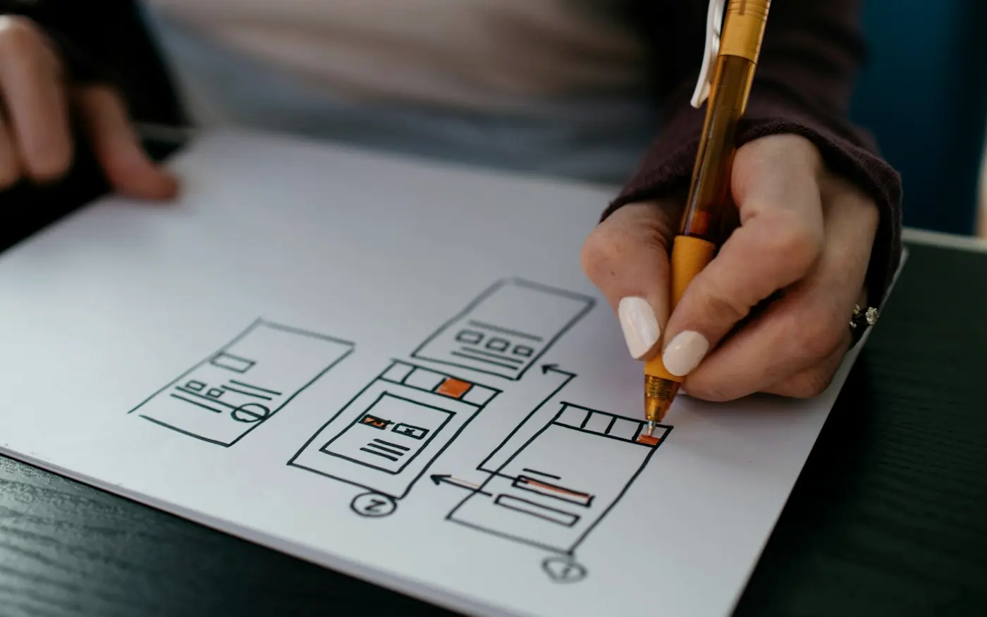



As SaaS platforms grow, adding more features often makes the product harder to use. Learn how world-class product teams fight feature creep and preserve clarity through intentional UX design.
A SaaS product rarely becomes complicated because someone deliberately decided to make it complicated. More often, complexity arrives quietly. A customer asks for a feature, the sales team promises something important to win a deal, an enterprise client needs a different workflow, the product team introduces another setting, developers add another integration and suddenly the simple platform that people loved six months ago has become a maze of dashboards, menus, notifications, permissions and configuration screens.
This is one of the less obvious problems of SaaS growth. The platform is technically becoming more capable, but the experience can become progressively harder to understand. Features accumulate faster than the product team can reconsider the overall experience. What once took two clicks now takes six. A dashboard that originally showed five useful metrics now contains twenty-seven. Settings become increasingly difficult to navigate, different customer types need different workflows and users begin asking support questions about functions that were supposed to make their lives easier.
The uncomfortable part is that this can happen while the product team is doing everything that appears sensible. Customers are requesting features. Revenue is growing. The roadmap is full. New integrations are being released. The engineering team is shipping. From inside the organisation, there is constant progress. From the user's perspective, however, the product can slowly start feeling like a room where somebody keeps adding furniture without ever removing anything.
That is the SaaS complexity trap.
For SaaS founders and product teams, the challenge is not simply building more functionality. It is deciding what deserves to exist, who needs it, when they need it and how much of the underlying complexity users should actually have to experience.
At CreativeIyke, this is one of the reasons we treat UX, product strategy and engineering as connected disciplines. A scalable SaaS product is not simply one that can technically support more customers. It is one that can grow in capability without making the experience progressively more difficult to use.
Growth Creates Complexity. Good Product Design Contains It.
Early-stage SaaS products tend to be relatively focused because they have to be. There may be one primary customer segment, one core problem and a small number of workflows. The product team knows what the product is supposed to do because there simply aren't enough features for the identity of the product to become blurred.
Growth changes that equation.
As the platform attracts more customers, the demands become more diverse. Small businesses might want simplicity while larger organisations request advanced controls. One customer wants automation, another wants more reporting and another wants a completely different integration. Sales wants features that help close enterprise contracts. Customer success wants tools that reduce support workload. Marketing wants functionality that makes the product easier to demonstrate. Operations wants administrative controls. Developers need to maintain the underlying architecture.
Every request can sound reasonable on its own.
The problem is what happens when they all become part of the same product experience.
Accumulative Product Gravity & Cognitive Load
INITIAL STATESingle focus • Clear mental model • Rapid task completion
Caption: SaaS complexity rarely arrives through one bad decision. It accumulates through many reasonable decisions made without continuously reconsidering the whole product experience.
The answer is not to stop adding features. A SaaS product that never evolves will eventually become irrelevant. The challenge is to create an architecture and experience that allow the product to become more powerful without forcing every user to understand everything the platform can do.
That distinction is critical.
Complex software does not have to feel complicated.
The Difference Between Product Complexity and User Complexity
One of the most useful distinctions a SaaS team can make is between system complexity and user-facing complexity. The underlying product may need to become sophisticated as the business grows. It may require multiple databases, APIs, integrations, permission structures, automation engines, billing rules and sophisticated reporting. None of that necessarily needs to be visible to the person using the product.
Think about an aircraft cockpit. The technology involved in operating a modern aircraft is extraordinarily complex, but the pilot does not need to interact with every underlying system individually. The interface is designed to expose the information and controls required for the task at hand while keeping enormous amounts of underlying complexity out of the immediate experience.
SaaS products can apply the same principle.
A finance platform may contain sophisticated accounting logic, tax calculations, payment integrations and audit trails. A user running a simple report does not necessarily need to understand any of those systems. A property management platform may contain complex data structures involving properties, tenants, owners, payments, maintenance and compliance, but an individual user may only need to see the information relevant to their role.
The goal of good SaaS UX is therefore not to eliminate complexity from the product itself. It is to manage where that complexity appears.
Five Ways Growing SaaS Products Become Harder to Use
1. Feature Creep Turns the Product Into a Toolbox
Feature creep is one of the most common causes of SaaS complexity. A product starts with a clear value proposition, then gradually becomes a collection of capabilities. Each new feature is justified by a customer request, market opportunity or strategic initiative. Eventually, the original simplicity of the product becomes difficult to recognise.
The warning sign is usually not the number of features itself. It is the number of things users are expected to understand before they can complete a task. If a new customer needs an extensive onboarding session simply to understand where everything lives, the product may have crossed an important threshold. The platform might be powerful, but power without structure can become friction.
A useful product question is therefore not simply "Should we build this feature?" but "Where does this feature belong in the user's mental model of the product?" If the answer requires adding another top-level navigation item, another dashboard or another complex settings area every time a capability is introduced, the problem may be architectural rather than cosmetic.
2. Different Customers Start Pulling the Product in Different Directions
SaaS companies often discover that their customers are not as homogeneous as they originally assumed. A startup may initially target small businesses and later attract larger organisations. An application built for individual users may develop a demand for team management. A simple workflow tool may evolve into an enterprise platform with administrators, managers, contributors and external collaborators.
This is commercially exciting, but it introduces a difficult UX challenge. Different users have different goals, responsibilities and levels of expertise. Giving everyone the same interface can make the product overwhelming for less sophisticated users while still failing to provide enough functionality for advanced customers.
Role-based experiences can help solve this problem. Instead of forcing every user through the same interface, the product can adapt navigation, permissions, dashboards and workflows according to what a person actually needs to accomplish. The underlying platform can remain powerful while the visible experience becomes more focused.
Role-Aware Experience Decomposition
| User Type | Primary Need | What They May Need to See | What Can Stay Hidden |
|---|---|---|---|
| Owner | Business oversight | Performance, revenue, key insights | Technical configuration |
| Manager | Operational control | Teams, workflows, approvals | Infrastructure settings |
| Staff User | Task completion | Assigned work, relevant records | Advanced administration |
| Administrator | System management | Users, permissions, integrations | Customer-specific workflows |
| Customer | Self-service | Account, activity, support | Internal operations |
Caption: A scalable SaaS product does not need to expose the same level of complexity to every user. Role-aware experiences can preserve capability while reducing unnecessary cognitive load.
3. Settings Become a Graveyard for Unresolved Complexity
Settings are where SaaS products often send features when nobody knows where else to put them. A configuration appears, another option is added beneath it, then another advanced setting appears somewhere else. Eventually, users have to navigate a dense collection of switches, dropdowns and technical terminology simply to configure their account.
There is nothing inherently wrong with having extensive settings. Complex businesses need control. The problem is when the product assumes that every user should understand those controls or that every configuration decision deserves equal prominence.
Progressive disclosure can be extremely useful here. Basic controls can remain visible to most users while advanced functionality is revealed when it becomes relevant. Contextual explanations, sensible defaults and task-specific configuration can also reduce the burden. A user should ideally be able to accomplish the common task without first becoming an expert in the architecture of your software.
This is particularly important for SaaS onboarding. If a new customer is immediately confronted with dozens of configuration decisions, the product is effectively asking them to design the system before they have experienced its value. That is backwards. Let users reach the useful part of the product first, then introduce complexity when there is a reason for it.
4. The Dashboard Problem: More Data Does Not Mean More Insight
Dashboards deserve special attention because they are one of the easiest places for SaaS products to become visually impressive while becoming less useful.
As a platform grows, teams naturally want to add more information. Revenue, users, activity, conversion rates, tasks, alerts, performance indicators, reports and operational metrics all compete for attention. Eventually the dashboard becomes a wall of cards.
The problem is that a dashboard is not a storage area for every piece of information the system knows.
A good dashboard should help a particular user understand what matters, what changed and what they may need to do next. That requires prioritisation. If everything has equal visual weight, nothing has priority. A user shouldn't have to scan twenty-seven metrics to discover the one thing that actually requires their attention.
Feature-Heavy vs Decision-Focused Architecture
A crowded dashboard containing numerous cards, charts, notifications and metrics competing for attention without priority.
- • 27 unprioritised telemetry metrics
- • Cluttered visual noise & cognitive strain
- • Slow path to key operational action
Demonstrates that simplification is not about removing useful data. It is about organising information around decisions.
Caption: The best SaaS dashboard is not necessarily the one that shows the most information. It is the one that helps the user make the right decision quickly.
5. Integrations Can Create Invisible Complexity
Integrations are one of the great strengths of modern SaaS. Connecting your platform to Stripe, Salesforce, HubSpot, Google, Microsoft, accounting platforms, communication tools and other services can make a product considerably more valuable. But integrations can also create an enormous amount of complexity behind apparently simple workflows.
A user might connect an external service and suddenly encounter API permissions, synchronisation rules, field mappings, authentication errors, duplicate records and conflicting data. From the engineering perspective, these may be unavoidable technical considerations. From the user's perspective, they are simply obstacles preventing the product from doing what they expected.
This is where product design and engineering need to work closely together. The interface should communicate what is happening without exposing unnecessary technical detail. Errors should explain what the user can actually do about the problem. Synchronisation should have sensible defaults. Where possible, the platform should handle technical complexity automatically rather than requiring users to become integration specialists.
A good integration should feel almost boring.
That is usually a compliment.
The Enterprise Feature Trap
Enterprise customers can be extremely valuable for SaaS businesses, but they can also introduce a particular form of product complexity. Large organisations often have legitimate requirements around permissions, security, reporting, audit trails, approvals, integrations and administration. Winning an enterprise contract can therefore create pressure to add significant functionality to the platform.
The danger comes when enterprise requirements become the default experience for everyone.
A small business may not need advanced approval workflows. An individual user may not need organisation-wide administration. A customer who wants to complete one task should not necessarily have to navigate a platform designed around the needs of a 10,000-person enterprise.
This is why SaaS architecture should support complexity at the system level while allowing simplicity at the experience level. Advanced functionality can exist without becoming the centre of the product. Enterprise users can have the controls they need while other users experience a much more focused environment.
Why "Just Add Another Menu Item" Eventually Stops Working
Navigation is often treated as a simple design problem. A feature needs somewhere to live, so it gets added to the navigation. But navigation is actually a representation of the product's mental model. Every new top-level item tells users that this is an important category they need to understand.
Eventually, the navigation becomes a catalogue of the organisation's internal structure rather than a reflection of the user's needs. Products start exposing terminology that makes perfect sense internally but means very little to customers.
This is where information architecture becomes critical. The question is not simply where a feature can be placed. It is how users naturally expect to find it. Related functionality should be grouped meaningfully, terminology should reflect the user's language and navigation should prioritise the tasks people actually perform.
For growing SaaS platforms, information architecture should also be treated as something that evolves. The structure that worked for 500 customers may not work for 50,000. Product teams need to periodically step back and ask whether the navigation still represents the product clearly or whether it has become a historical record of every feature the company has ever shipped.
The Solution Is Not Always a Redesign
When SaaS complexity becomes a problem, the instinct is often to redesign the interface. Sometimes that is appropriate, but a visual redesign cannot solve structural problems on its own.
If five different features do essentially the same thing, changing their colours and spacing will not solve the underlying duplication. If a workflow requires information from three disconnected systems, a prettier interface will not fix the integration problem. If customers have different roles but the architecture treats everyone the same, a new visual design may simply make the same complexity look nicer.
This is why CreativeIyke's approach begins with Audit.
Before redesigning a growing SaaS product, we look at the existing experience, user journeys, technical landscape, business objectives and constraints. We want to understand where complexity originates rather than simply where it becomes visible. From there, we can determine whether the right intervention is information architecture, workflow redesign, product restructuring, a new design system, technical refactoring, automation or some combination of these.
The interface is often where the problem becomes visible.
It isn't necessarily where the problem begins.
Design Systems Become More Important as SaaS Products Grow
A design system is often described as a collection of reusable UI components, but its value extends beyond visual consistency. For a growing SaaS product, a well-designed system can create a shared language between design and engineering while making it easier to introduce new functionality without reinventing the interface every time.
Buttons, forms, tables, modals, navigation patterns, notifications and data visualisations can all follow established rules. More importantly, those components can carry interaction behaviour, accessibility considerations and responsive behaviour with them. This allows product teams to focus more of their attention on solving the actual user problem rather than repeatedly deciding how a basic interface element should work.
The design system should not become another layer of bureaucracy, though. If designers and developers spend more time maintaining the system than improving the product, it has become counterproductive. The best systems evolve alongside the product and provide enough consistency to create coherence without preventing useful innovation.
Build for the User You Have Today, Without Breaking the User You'll Have Tomorrow
Scalability is often discussed in SaaS purely as a technical concept. Can the infrastructure handle more users? Can the database handle more records? Can the API handle more requests? These questions matter enormously, but there is another form of scalability that receives less attention: experience scalability.
Can someone who has never used the product understand it quickly? Can an experienced user become more efficient without being overwhelmed? Can new features be introduced without completely restructuring the navigation? Can different customer segments use the same platform without receiving an identical experience? Can administrators manage complexity without exposing it to everyone else?
These are product scalability questions.
A SaaS platform that can support one million users but requires every new customer to attend a two-hour training session has technically scaled. From a product perspective, something has gone wrong.
How CreativeIyke Approaches SaaS Complexity
Our process is designed around the idea that SaaS products should become more capable without becoming unnecessarily more difficult to use. We start with Discovery & Audit, examining stakeholder goals, user experience, existing systems, technical constraints and the areas where users or internal teams are experiencing friction. This gives us a foundation for understanding whether the problem is primarily UX, architecture, workflow, technology or a combination of several factors.
We then move into System Architecture & UX, where user journeys, information architecture, wireframes, component systems, database structures and integrations are considered together. This stage is particularly important for SaaS because the interface and the underlying system need to evolve together. A beautifully designed journey that cannot scale technically is not a successful solution, just as technically sophisticated software with a confusing experience is not a successful product.
During Full-Stack Development, we bring the architecture and experience into a working product through frontend and backend engineering, cloud infrastructure, third-party integrations, testing and quality assurance. The goal is not simply to ship more functionality. It is to build a foundation that can support future growth without creating unnecessary technical and UX debt.
Finally, Launch & Optimisation allows the product to learn from reality. Analytics, user behaviour, performance data and feedback reveal where the experience is working and where it is creating friction. SaaS products are never truly finished, and a strong optimisation process allows the platform to evolve deliberately rather than accumulating features reactively.
01 DISCOVER → 02 ARCHITECT → 03 BUILD → 04 OPTIMISE
Identify where complexity originates.
Simplify journeys and structure the product intelligently.
Engineer scalable functionality and integrations.
Use real-world behaviour to continuously improve the experience.
Caption: CreativeIyke's Solution First process connects product strategy, UX and engineering so SaaS platforms can scale without allowing complexity to take over the user experience.
A Simple Test for SaaS Product Teams
There is a useful exercise any SaaS product team can perform when they suspect the platform is becoming too complicated. Pick one of your most important user journeys and ask someone unfamiliar with the latest version of the product to complete it without assistance. Don't explain the interface. Don't tell them where to click. Don't rescue them when they hesitate.
Watch what happens.
Where do they stop? What do they misunderstand? Which labels do they interpret differently from your team? Which information do they expect to see but cannot find? Which options do they ignore because there are simply too many? Where do they ask, "What does this mean?" Those moments are often more valuable than another internal product meeting because they reveal the gap between how the organisation thinks about the product and how customers actually experience it.
The exercise can then be repeated with existing customers, different user roles and more complex workflows. Patterns will begin to emerge. Some problems may be superficial. Others will point towards deeper issues in information architecture, product strategy or system design. The important thing is to resist the temptation to fix every individual problem immediately. First understand the pattern.
Your SaaS Product Should Grow in Capability, Not Friction
Growth is supposed to make a SaaS product more valuable. But without deliberate product thinking, growth can also make the product harder to understand, harder to navigate and harder to maintain. Features accumulate, customer segments diverge, integrations multiply and internal requirements become visible in the interface. Eventually, the product begins reflecting the complexity of the company that built it rather than the needs of the people who use it.
The answer is not to freeze the roadmap or remove every advanced capability. Powerful products need powerful functionality. The answer is to design the product so that its underlying sophistication does not become unnecessary cognitive work for the user. Complexity should be organised, contained and revealed when it becomes relevant rather than pushed onto everyone by default.
For SaaS founders and product teams, that means thinking beyond feature delivery. Every new capability changes the product's architecture, information hierarchy, navigation, onboarding and mental model. The question should therefore be bigger than "Can we build it?" It should be "Can we add this capability without making the product harder to understand?"
That is the difference between a SaaS platform that simply grows and one that scales intelligently.
At CreativeIyke, we help businesses design and build digital products where UX, technology and business strategy work together. Whether you're restructuring an existing SaaS platform, developing a new product, introducing AI-powered functionality or dealing with the complexity that comes with growth, our Solution First approach starts by understanding the problem before deciding what to build.
Your SaaS product doesn't have to become simpler by doing less. It can become simpler by hiding what users don't need, surfacing what they do, and designing the system intelligently underneath it all.
That's how you scale without creating chaos.
Talk to CreativeIyke About Your SaaS Product
Is your SaaS product becoming harder to use as it grows? Let's look beyond the interface and identify where product complexity is coming from, what users actually need and how your platform can scale without adding unnecessary friction.
LET'S BUILD THE RIGHT THING
UX/UI designer and developer in Birmingham, UK. I design and build digital products for SaaS, fintech and public sector teams.