


Case study: UX/UI and service design for Trafford Council
Trafford Council
Transforming a complex public service website, from fragmented experiences to a more consistent, accessible and maintainable council website, ending with the move from Contensis to Drupal.
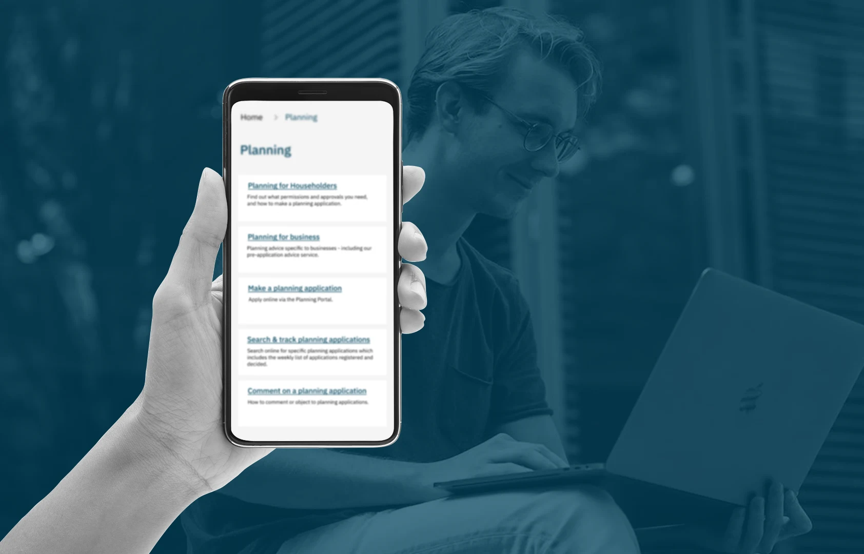
A digital estate that had grown in every direction
Trafford Council's website had grown over time into a large and complex digital estate. It gave residents access to a wide range of services, but the experience had become fragmented across the main site, its microsites and individual pages.
Colours, typography, font sizes, logos, spacing and components varied from one area to the next, so it felt less like one service and more like a collection of separate ones. Underneath that sat outdated content, broken links and an information architecture that did not match how residents look for things. The job was bigger than making the website look better.
Understanding the problem first
Rather than starting with a visual redesign, I set out to understand the problems behind the existing experience. They fell into four connected pillars.
Typography, colours, logo use, font sizes, spacing and page structures varied across the main site and its microsites, so there was no clear, recognisable identity.
Outdated information and links that no longer served a purpose. On a council website that is not cosmetic: people rely on it to understand services and get support.
Content had built up over time without a shared structure. The work needed to rethink how information was grouped and presented around how people actually look for it.
Any new CMS had to work within the council's Microsoft environment and core public sector systems, not just look good from a design point of view.
A full audit of the digital estate
I treated the project as a mix of UX, service design, content structure, visual consistency and technical collaboration. The first step was understanding how each problem affected residents and the teams who manage the site.
That made one thing clear early: the project had to fix the system behind the website, not add a new visual layer on top. I reviewed the whole site and its microsites against a clear checklist, which turned a pile of individual issues into one clear picture.
- Visual consistency across pages and microsites
- Typography and font size variations
- Colour use and WCAG contrast
- Logo and brand application
- Page layouts and reusable components
- Information architecture and taxonomies
- Navigation and resident journeys
- Outdated content and obsolete pages
- Broken links and dead ends
- Content structure and readability
- Limits of the existing Contensis CMS
- Long-term maintainability
A design style guide everyone could share
One of the key outputs was a design style guide. Instead of fixing visual problems page by page, it gave designers, developers and content teams one shared reference.
The important shift was from designing individual pages to a reusable design language, which also reduces the risk of the same inconsistencies creeping back as new content and services are added.
Clear rules for the Trafford identity, anchored by Trafford Blue for headers and brand elements and yellow for focus and on-click states.
One corporate typeface with IBM Plex Mono for technical data, and a type scale from 48px headings down to 14px helper text.
Base, border, link, feedback and extended palettes, each checked against WCAG 2.1 AA and AAA contrast.
Search, action buttons with yellow focus rings, warning callouts, accordions and form controls, used the same way everywhere.
An 8 point spacing grid, touch targets of at least 44px for mobile users and responsive scaling from desktop to phone.
Organised around residents, not departments
Visual consistency alone could not fix the navigation. Organisational structures make sense inside the council, but residents arrive with a task or a question, not knowledge of which department owns the answer.
So the work looked at the relationships between pages, categories and information, simplified navigation and made it easier to move between related content without getting lost. The aim was not simply fewer pages, but a clearer relationship between people, information and services. Someone might need to report something, apply for something, find a requirement or get support, and the structure has to get them there with as little friction as possible.
Content quality is part of the experience
Websites naturally build up information. Policies change, services move and old pages stay live long after their purpose has gone. Without good governance, people meet conflicting, outdated or duplicated information.
I treated this as part of the UX work, not something separate. Outdated content was reviewed and broken links and problem journeys were found and resolved, because even the best interface cannot make up for information that is wrong, unclear or no longer relevant.
Working across design, content and technology
The project was never an isolated design exercise. I worked with internal and external developers, content writers, graphic designers and stakeholders, bringing their knowledge into the design and delivery process.
My role sat between these groups, translating user and service needs into practical design decisions while respecting technical constraints and organisational requirements. That mattered most during the CMS work, where the platform had to support how the council actually operates.
From Contensis to Drupal
Moving from Contensis to Drupal was more than moving pages between systems. The CMS had to support the council's future digital needs, its publishing processes and its wider technology, including Microsoft tools and core systems. Time was taken to assess whether Drupal was the right fit before moving forward, because technology should support the service rather than dictate it.
The migration was also a chance to rethink how content, page structures and components were managed, so existing problems were not simply carried into the new platform.
- Inconsistent pages and microsites
- Outdated content
- Broken links
- Inconsistent UI
- Complex information architecture
- UX and service audit
- Information architecture overhaul
- Design style guide
- Content governance review
- Technical assessment
- Drupal migration
- Consistent resident experience
- Simpler content management
- Task-based information architecture
- Reusable design patterns
- A maintainable, scalable platform
Designing for people who need something
A council website is not a marketing site. People visit because they need to report an issue, find support, understand a process or complete an important task, and they should never need to understand the council's internal structure to do it.
The interface is only one part of the experience. The quality of the service depends on the interface, the content, the systems behind it, the people running it and the processes that connect them. That view shaped every design decision.
A stronger foundation for the council
The website has been completed and migrated from Contensis to Drupal. Visual inconsistencies were tackled through a formal style guide, the information architecture was reviewed, outdated content and broken links were addressed, and the CMS was chosen with the council's technical ecosystem in mind.
Trafford now has a more consistent digital experience, a more maintainable platform for its teams and a shared framework for keeping things consistent as the estate grows.
Strategy and hands-on delivery
As Senior UX/UI and Service Designer, my work moved between strategic thinking and practical delivery, making sure design decisions could be understood and built by the wider team.
- UX and service design analysis
- Website and microsite audits
- Information architecture
- User journey thinking
- UI design and visual consistency
- The design style guide
- Accessibility
- Content and link quality reviews
- CMS and platform discussions
- Drupal migration considerations
- Working with internal developers
- Working with external development teams
- Working with content writers
- Working with graphic designers
- Stakeholder engagement
- Design to development collaboration
Understanding the service behind the screen
It is tempting to look at a large council website and see pages that need a visual refresh. Look underneath and you find information architecture, content governance, legacy technology, organisational structures, accessibility, internal teams, external suppliers and residents with very different needs.
That is why service design matters. A website can have beautiful typography and still frustrate people if information is hard to find. A well designed service can make complexity feel surprisingly simple. Trafford was about creating the conditions for design, content, technology and the organisation to pull in the same direction.
Project outcome at a glance
| Area | Challenge | Approach | Outcome |
|---|---|---|---|
| Visual design | Inconsistent colours, typography, logos and UI across pages and microsites | A formal style guide built on Trafford Blue, focus yellow and IBM Plex Sans | Consistent visuals and WCAG 2.1 AA compliance |
| Information architecture | Hard navigation and fragmented content | Reviewed information relationships and user journeys | Clearer content organisation |
| Content | Outdated information and broken links | Content and link review | Better content quality and reliability |
| CMS | The existing Contensis environment | Assessed organisational and technical requirements | Migration to Drupal |
| Collaboration | Many internal and external teams | Worked across development, content, design and stakeholders | Better cross-functional delivery |
| Service design | A website treated as pages, not a service | Considered users, content, systems and processes | A more joined-up transformation |
Improving a public sector website is rarely about redesigning screens. It is about understanding the service behind them.
- ✦UX and service design analysis
- ✦A full website and microsite audit
- ✦Information architecture and user journey restructuring
- ✦The Trafford Council design style guide and component library
- ✦WCAG 2.1 AA accessibility checks
- ✦A content governance and link quality review
- ✦Technical assessment and migration from Contensis to Drupal