

Case study: brand identity for Lufthansa CityLine's internal chat app
Squawk identity
Squawk is Lufthansa CityLine's internal chat and collaboration app, built to connect crew in the air with colleagues on the ground. I designed its name mark and app icons.
One app for everyone in the company
Lufthansa CityLine needed a company-wide app for chat and collaboration. It had to bring together crew members and ground staff, two groups who work closely but rarely in the same place.
The app runs on iOS only, designed mainly for the iPhone SE and iPad mini that crew carry with them. The identity had to work beautifully at the small sizes those devices demand.
A word every pilot already knows
Squawk comes from aviation. A squawk code is the number an aircraft's transponder sends so that ground radar can identify it. It is, quite literally, how the air talks to the ground.
That made it a perfect name for an app whose whole purpose is connecting people in the air with people on the ground, and a strong starting point for the mark.
Conversation and flight in one symbol
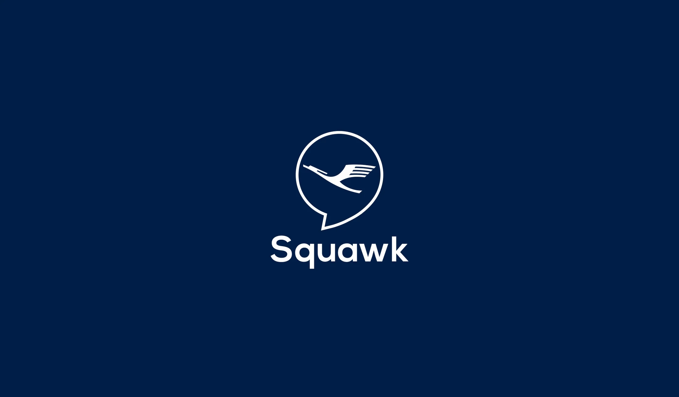
The logo places a bird in flight inside a speech bubble. The bubble says conversation. The bird says flight and nods to the heritage of the parent airline without copying it.
It is drawn as a single clean line weight, so it stays crisp on a small home screen, and it sits in a deep navy and white palette that feels at home in an airline environment.
Built for the home screen first
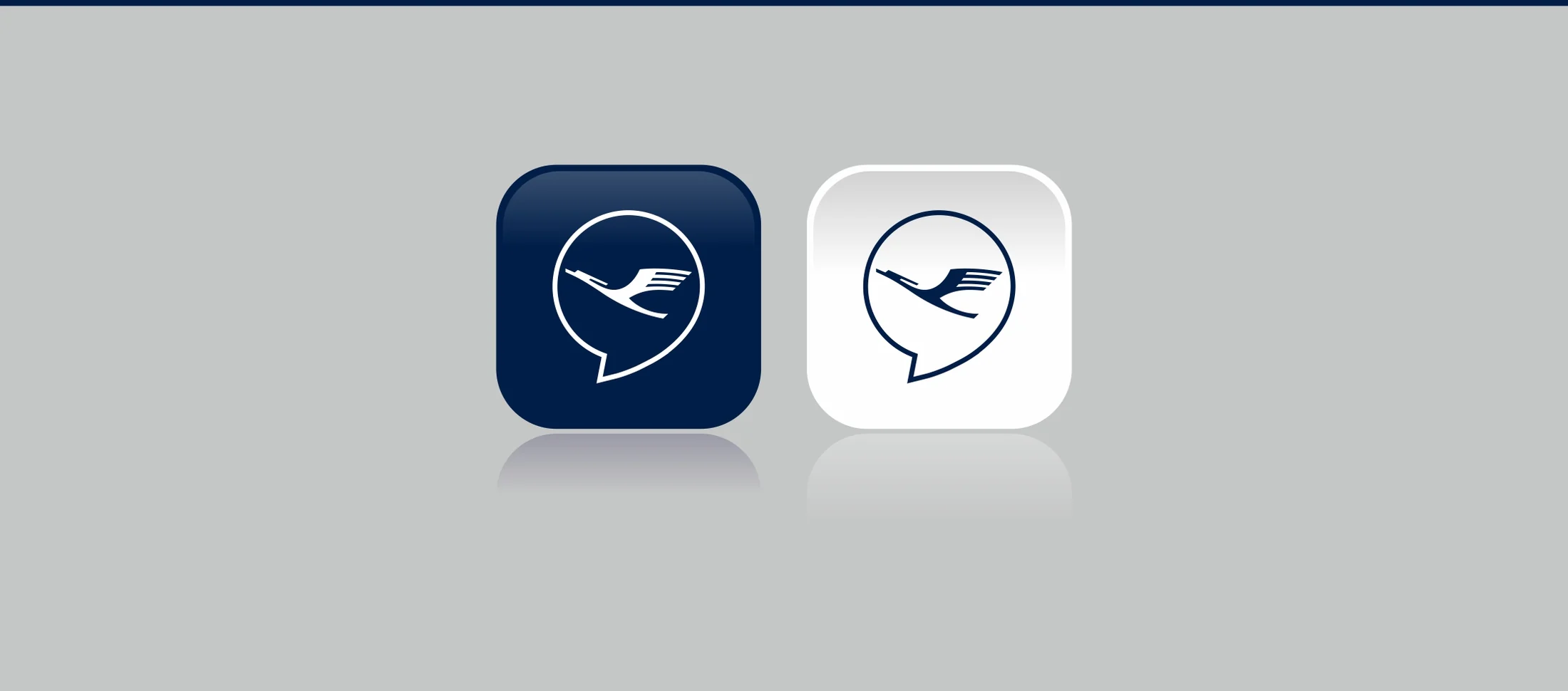
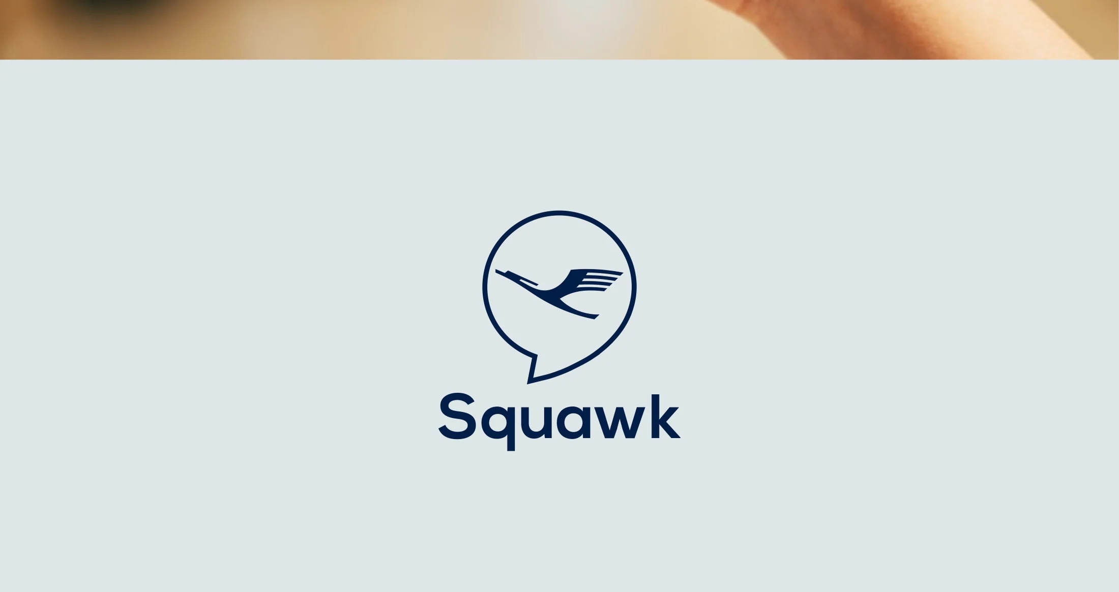
App icons come in dark and light versions, tested at real size on the devices crew use every day. The word mark pairs with the symbol for splash screens and internal materials, on both dark and light backgrounds.
The result is a simple, memorable identity that people recognise at a glance, which matters when you are opening an app between flights.
A squawk code tells the ground who is in the air. The app needed to do the same for people.
- ✦The Squawk name mark and symbol
- ✦Dark and light app icons for iPhone and iPad
- ✦Colour palette and lockups for dark and light backgrounds