


Case study: UX research and UX/UI design for a crypto wallet app
CryptGen
A cryptocurrency wallet and trading app for people who want to manage digital assets without needing to be experts. I took it from user research to a complete high-fidelity design.
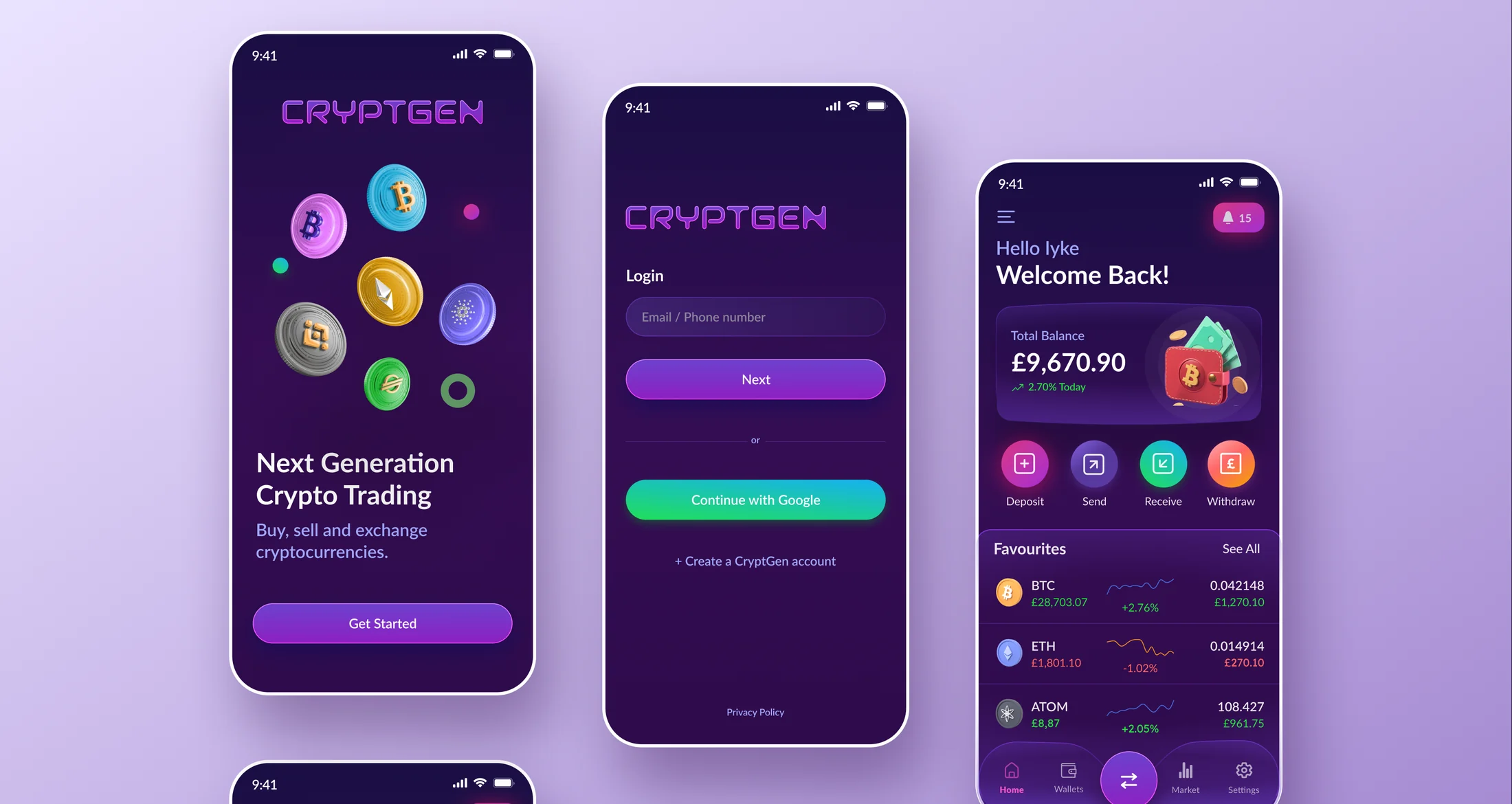
A crypto app that does not assume you are an expert
CryptGen wanted a place to store, manage and trade digital assets. The market already had big names, so the app needed a clear reason to exist.
The challenge was balance. Crypto attracts seasoned traders and complete beginners at the same time. The app had to feel secure and capable for the first group, and calm and easy to follow for the second.
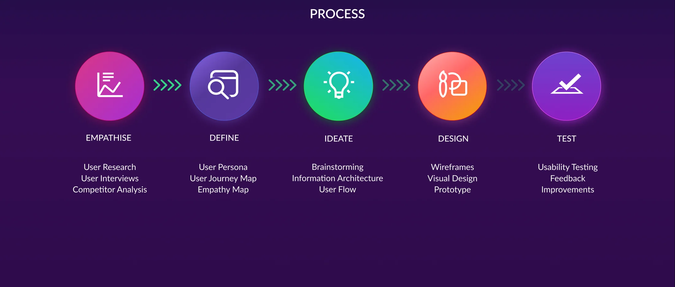
Learning from users and the apps they already use
I started by talking to the people CryptGen wanted to serve: mostly tech-comfortable people aged 25 to 40, living in cities, with experience ranging from active trading to just curious. Almost all of them managed their crypto on their phone.
The same worries kept coming up. People were nervous about security, found existing platforms confusing, and wanted better ways to follow their portfolio. A review of Coinbase, Binance and Crypto.com showed the gap clearly. Coinbase is easy to start with but limited and expensive. Binance is powerful but intimidating. Crypto.com does a lot, but its fees are hard to understand. Nobody was both approachable and capable.
One person to design for
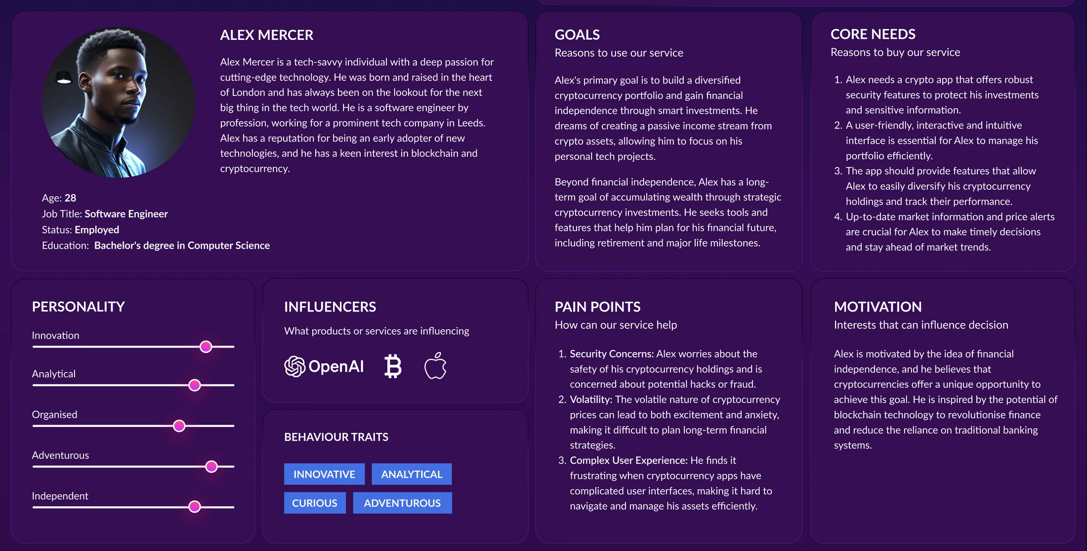
To keep decisions focused, I turned the research into a persona: Alex, a 28 year old software engineer in Leeds who wants to build a varied portfolio and keep an eye on it without living in a trading screen. An empathy map captured what he says, thinks, feels and does when he manages his money.
Alex's core needs became the design brief: security he can trust, an interface he understands at a glance, simple ways to diversify, and up to date prices with alerts that matter.
A simple map for a complicated subject
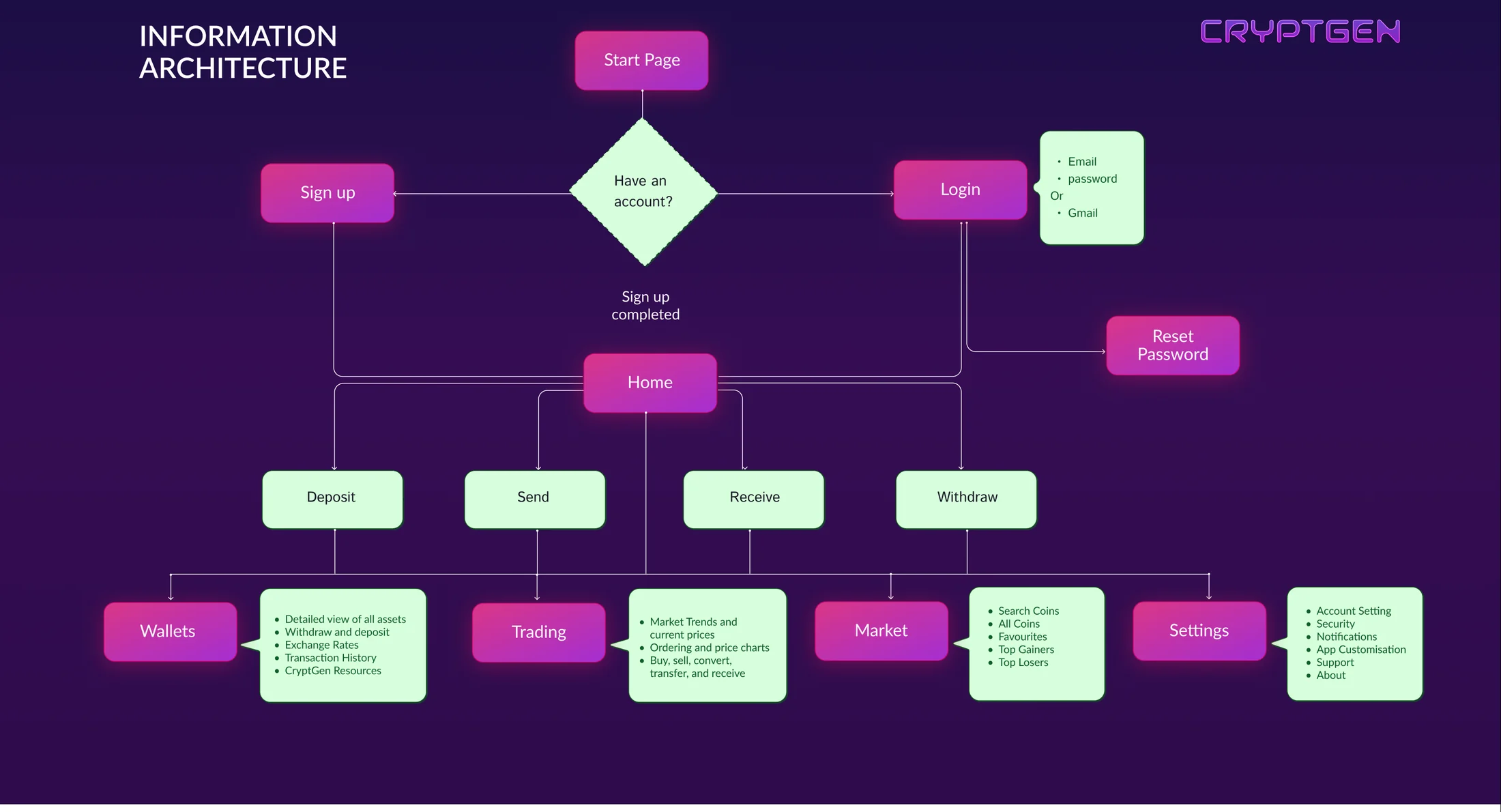
The information architecture keeps the app shallow. After signing up or logging in, everything starts from home, with four areas: wallets, trading, the market and settings. The four everyday actions, deposit, send, receive and withdraw, sit one tap away.
I mapped the main user flows before drawing any screens, so the structure was agreed early and every later design decision had somewhere sensible to live.
From wireframes to a confident visual language
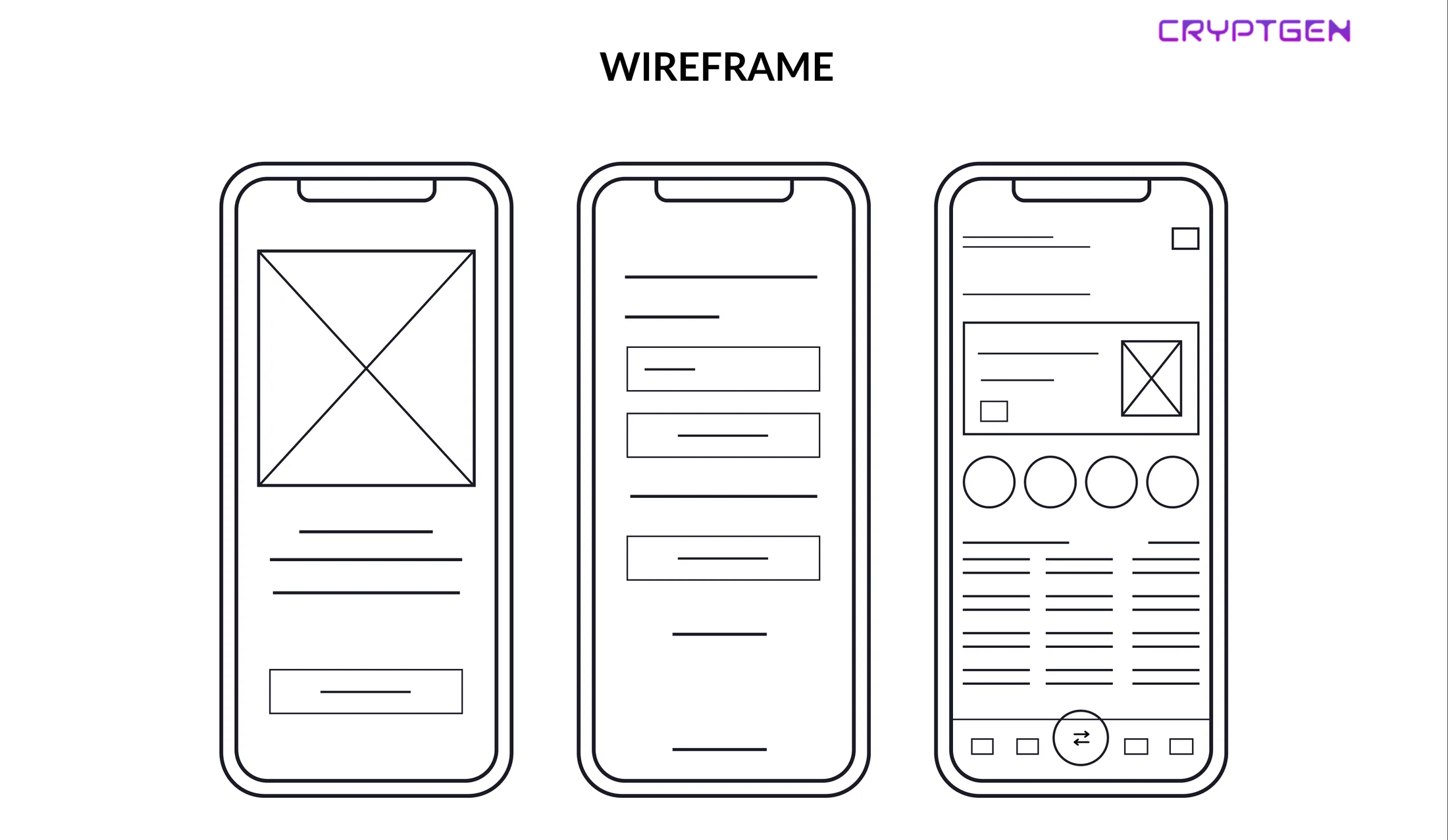
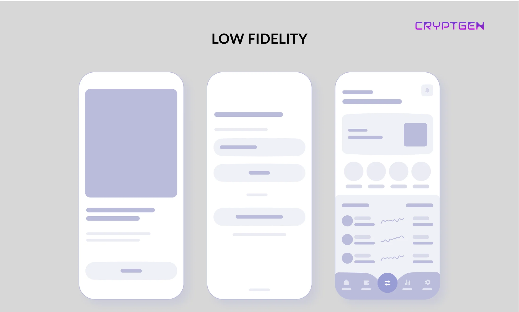
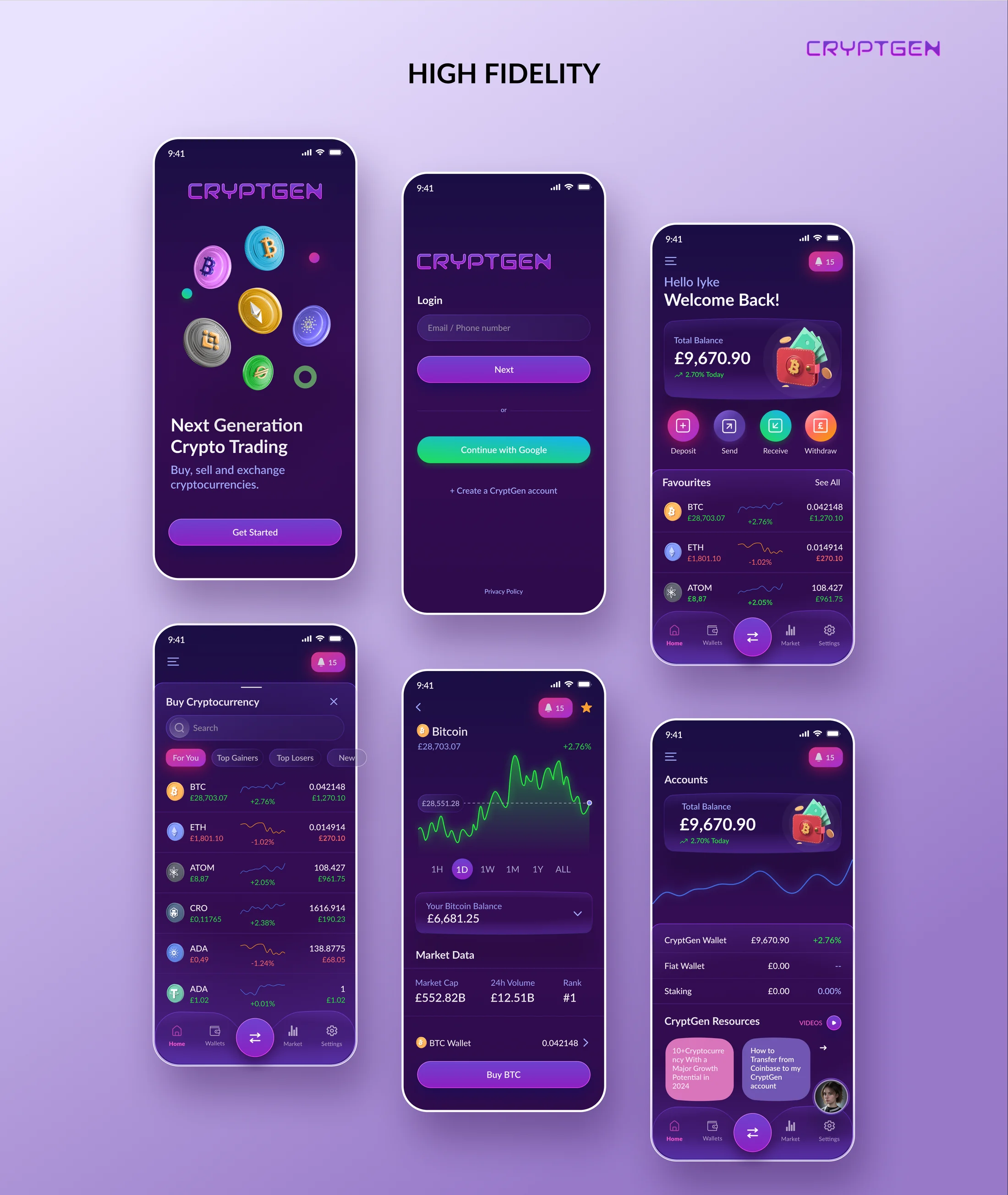
Wireframes and low fidelity screens tested the layout and the order of information without the distraction of colour. The home screen leads with the total balance, followed by favourite coins with small price charts, and one central button for trading.
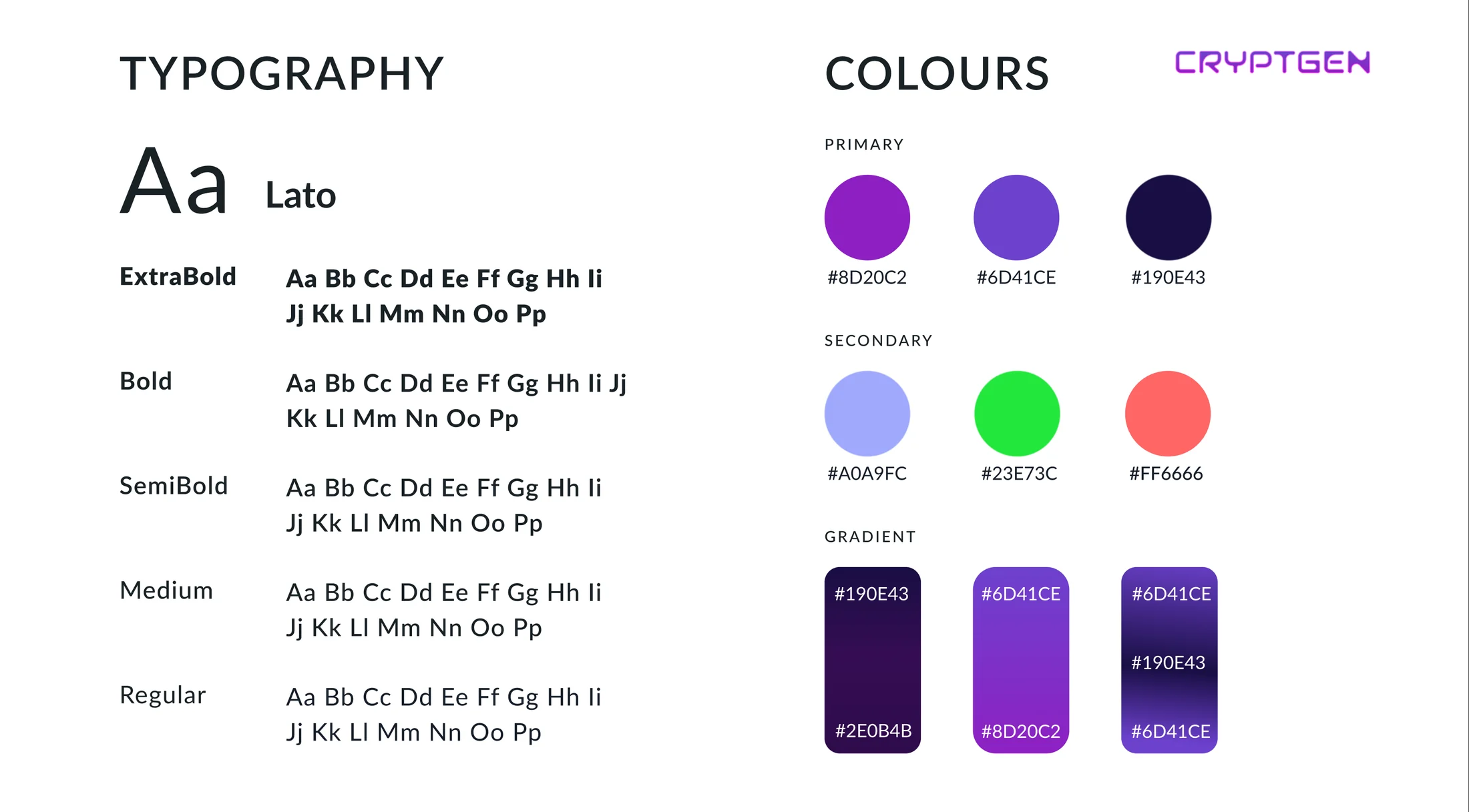
The high fidelity design uses a deep purple palette, Lato for clear numbers at small sizes, and soft three dimensional coin artwork to make the subject feel friendlier. A resources section with short guides and videos supports newer users without getting in the way of experienced ones.
Crypto apps often assume you already speak the language. CryptGen was designed for people still learning it.
- ✦User research findings and a review of three leading competitors
- ✦A persona and empathy map that kept decisions focused
- ✦Information architecture and core user flows
- ✦Wireframes, low fidelity and high fidelity screens
- ✦A visual language with colour, type and coin artwork
- ✦The CryptGen logo