


Case study: redesigning an e-commerce product page for a furniture retailer
My Sofa
Shoppers were leaving My Sofa's product pages too quickly. I redesigned the page around the questions people ask before they spend a lot of money on a sofa.
Good products, a page that let them down
My Sofa sells furniture online and already had a solid presence. The problem was one page: the product detail page. People arrived, looked briefly and left before adding anything to their basket.
I was asked to find out why, and to redesign the page so it did its job: helping someone feel confident enough to buy.
What customers told us
Research with existing customers gave a very clear list. The images were too small on a phone, so people could not picture the sofa in their home. They wanted to see it in the different colours available. They wanted to know where it was made, whether it had a warranty and how quickly it would arrive. And they wanted the dimensions to be easy to find and understand.
None of these were cosmetic. Each one was a reason not to buy, and together they explained why people were leaving.
Understand, sketch, prototype, test
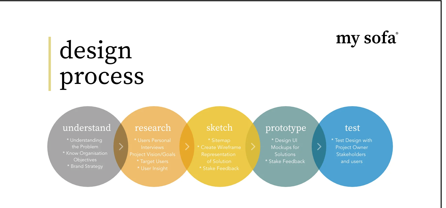
I worked through five stages: understanding the business and its goals, researching with users, sketching the structure as wireframes, building a prototype and testing it.
Testing included the project owner as well as customers. Seeing real people use the prototype made it easier to agree changes quickly, because everyone was looking at the same evidence.
Answering every question on one page
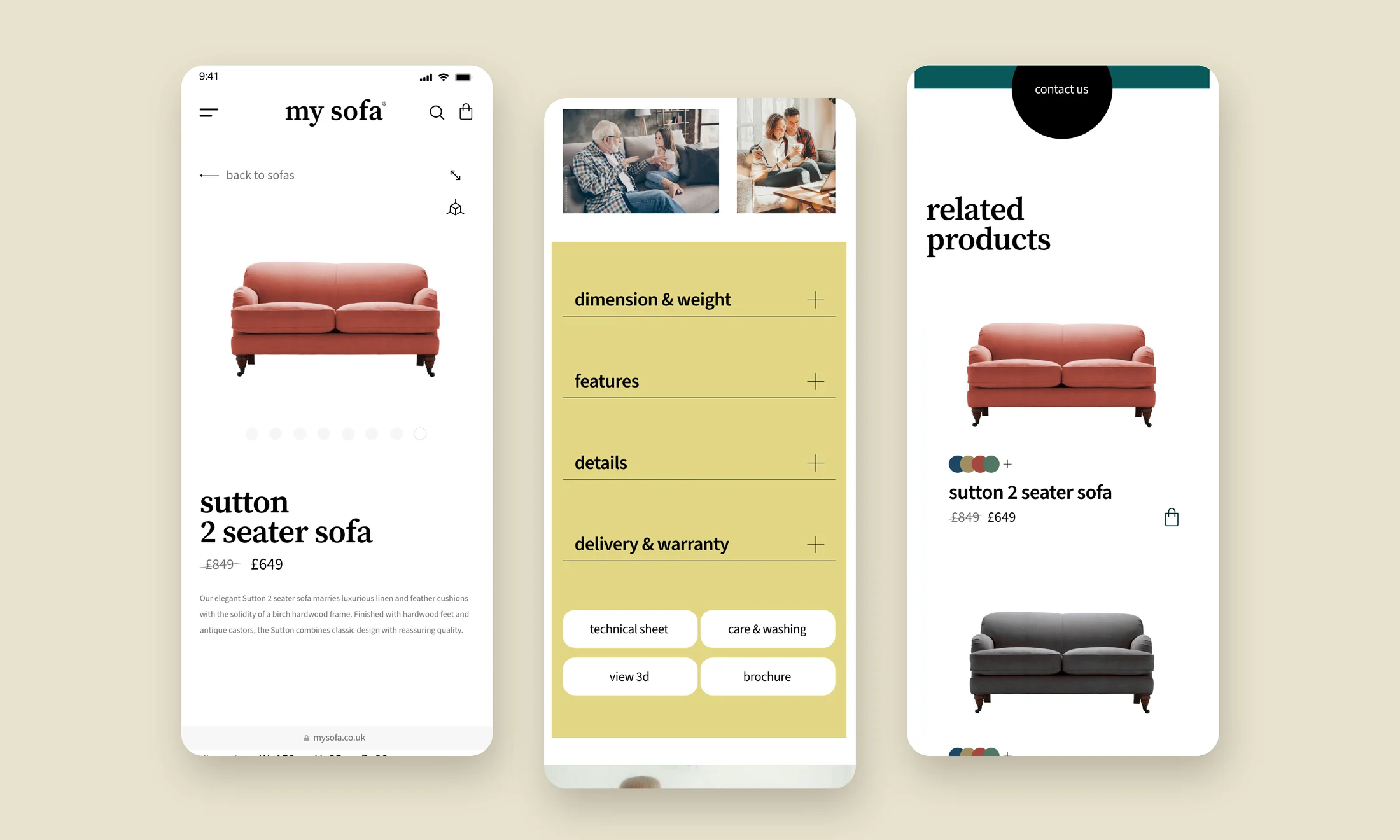
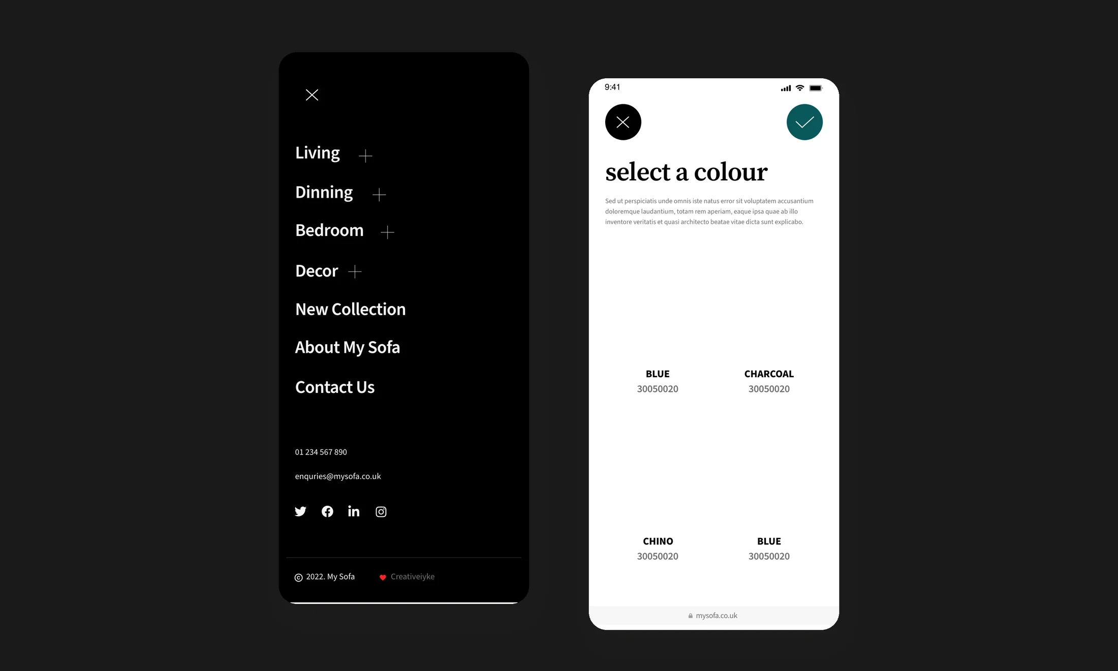
Images are now large and can be opened full screen, so people can study the fabric and shape. A colour selector shows the sofa in each available finish. The price, quantity and dimensions sit together near the top, where people look for them.
Below that, a simple set of expandable sections covers dimensions and weight, features, details, and delivery and warranty, with quick links to the technical sheet, care instructions, a 3D view and the brochure. Related products at the bottom give people somewhere to go next instead of leaving.
Furniture is bought with the imagination. The page has to help people picture the sofa in their own room.
- ✦Research findings from existing customers
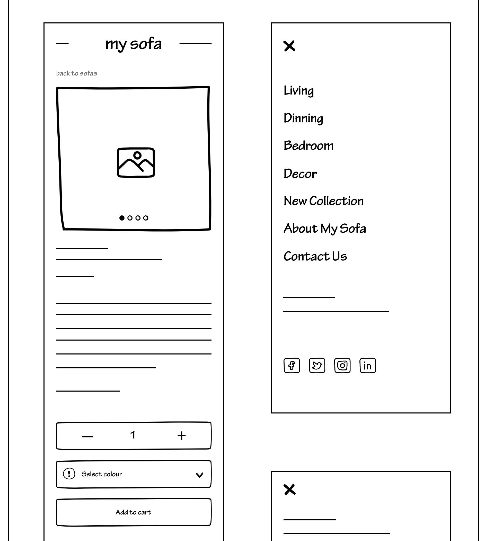
- ✦Wireframes for the full product page
- ✦A mobile-first prototype used for testing
- ✦Full-screen images and a colour selector
- ✦Clear dimensions, delivery and warranty information
- ✦Related products to keep people browsing